D.6 Annual average world surface temperature
D.6.1 Nature, origin and rationale of the data
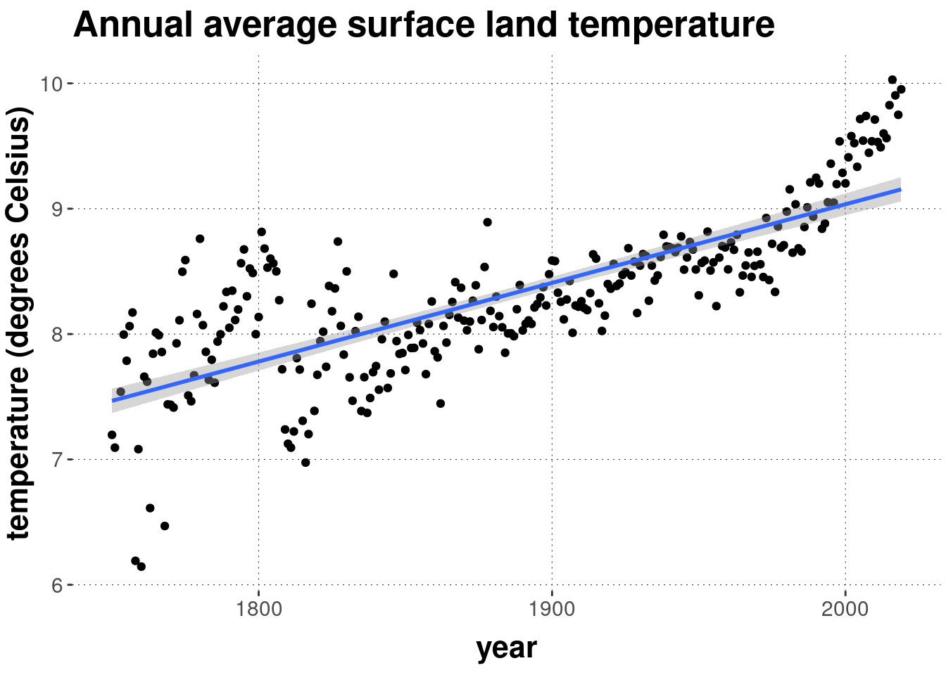
![]()
This data set has been downloaded from Berkeley Earth.97 More information on the origin and composition of this data set can be found here. Specifically, what we will use here is the time series data for “land only” using the annual summary of monthly average temperature. We have added to the data set used here the absolute average temperature. (Berkeley Earth only lists the “annual anomaly”, i.e., the deviation from a grand mean.)
Columns of interest are:
year: year of the observation (1750-2019)anomaly: deviation from the grand mean of 1750-1980, which equals 8.61 degrees Celsiusuncertainty: measure of uncertainty associated with the reportedanomalyavg_temp: the annual average world surface temperature
D.6.2 Loading and preprocessing the data
We load the data into a variable named data_temperature:
data_temperature <- aida::data_WorldTempAnd inspect the first rows of data:
head(data_temperature)## # A tibble: 6 × 4
## year anomaly uncertainty avg_temp
## <dbl> <dbl> <dbl> <dbl>
## 1 1750 -1.41 NA 7.20
## 2 1751 -1.52 NA 7.09
## 3 1753 -1.07 1.3 7.54
## 4 1754 -0.614 1.09 8.00
## 5 1755 -0.823 1.24 7.79
## 6 1756 -0.547 1.28 8.06D.6.3 Hypothesis & modeling approach
We care about whether the annual average temperature increased over time. We address this question with a simple linear regression model, in particular the relationship avg_temp ~ year. We are interested in whether the slope coefficient of that regression model is credibly/significantly bigger than zero.
Using a simple linear regression here is clearly and blatantly way too simple a modeling approach, but it serves our purposes and the violent simplification should make you think how/why exactly the linear regression model is conceptually inadequate for this data and inference model.
D.6.4 Plotting
Here is a scatterplot of annual average temperature avg_temp against year. The straight line is the best linear predictor.
data_temperature %>%
  ggplot(aes(x = year, y = avg_temp)) +
  geom_point() +
  geom_smooth(method = "lm") +
  labs(
    y = "temperature (degrees Celsius)",
    title = "Annual average surface land temperature"
  )
Downloaded on October 6th, 2020.↩︎