If we have grouping information, sometimes it can just get too much to put all of the information in a single plot, even if we use colors, shapes or line types for disambiguation. Facets are a great way to separately repeat the same kind of plot for different levels of relevant factors.
The functions facet_grid and facet_wrap are used for faceting. They both expect a formula-like syntax (we have not yet introduced formulas) using the notation ~ to separate factors. The difference between these functions shows most clearly when we have more than two factors. So let’s introduce a new factor early to the avocado price data, representing whether a recorded measurement was no later than the median date or not.
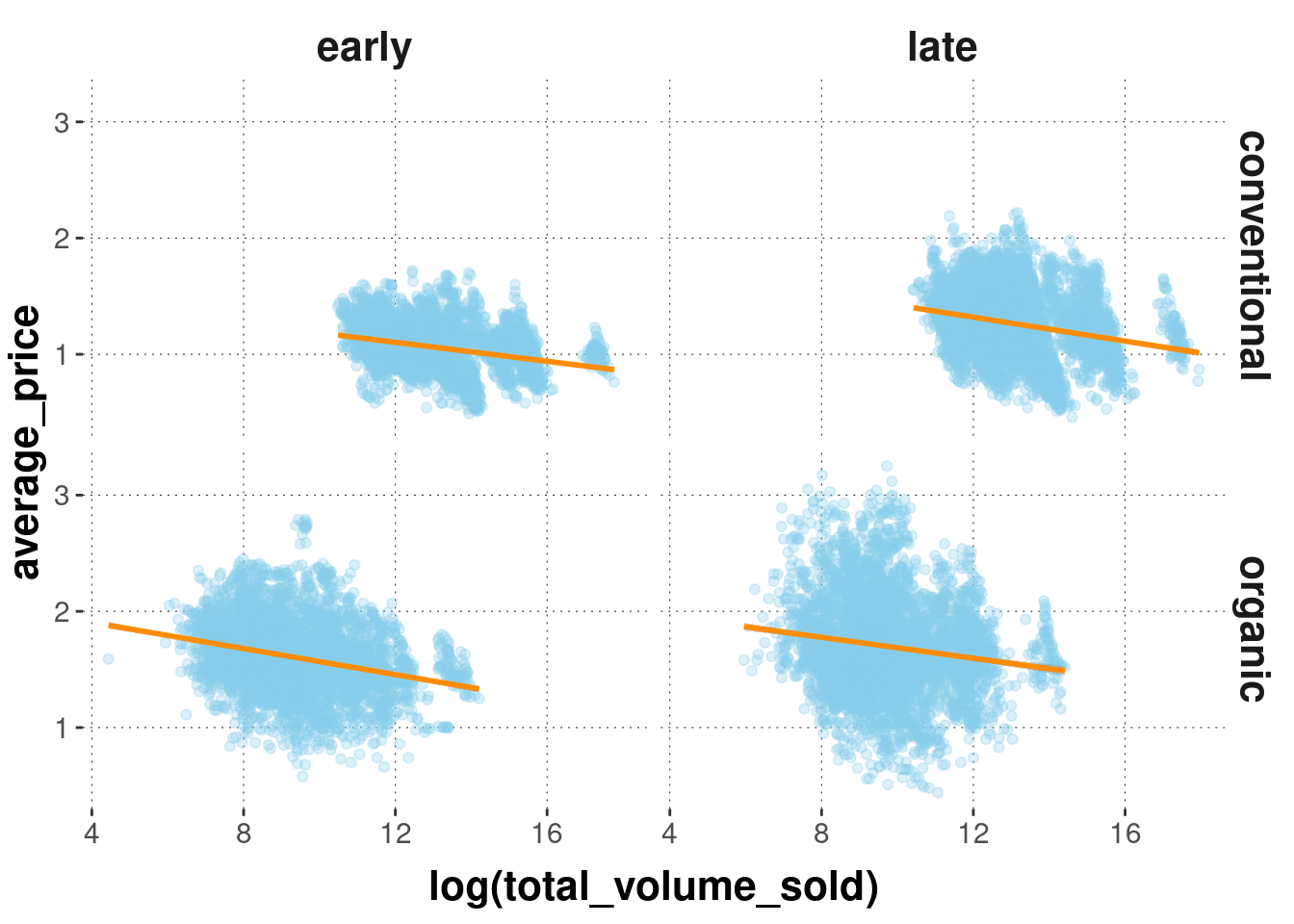
Using facet_grid we get a two-dimensional grid, and we can specify along which axis of this grid the different factor levels are to range by putting the factors in the formula notation like this: row_factor ~ col_factor.
avocado_data_early_late %>%ggplot(aes(x =log(total_volume_sold), y = average_price)) +geom_point(alpha =0.3, color ="skyblue") +geom_smooth(method ="lm", color ="darkorange") +facet_grid(type ~ early)
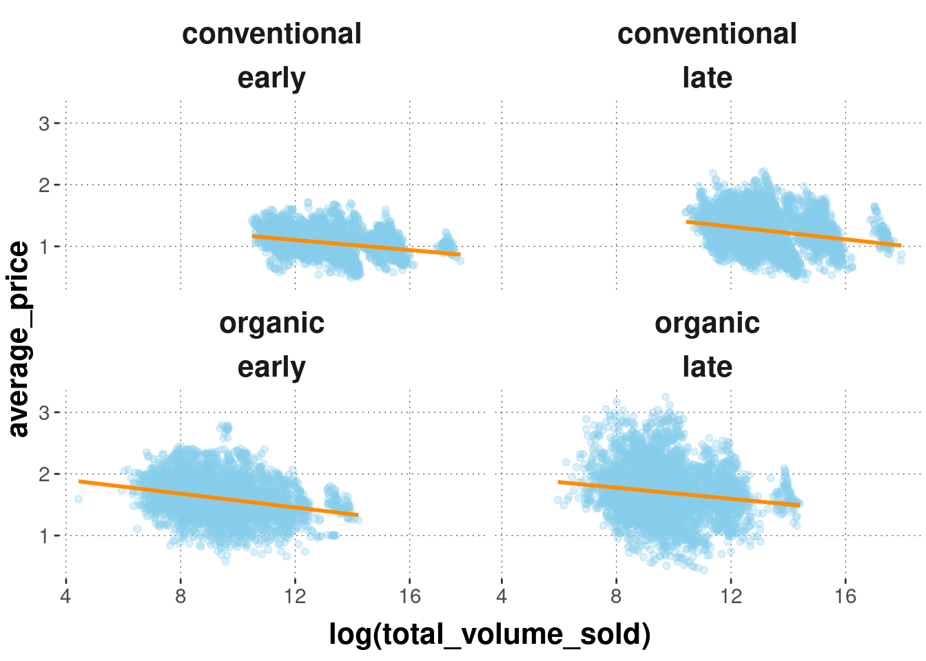
The same kind of plot realized with facet_wrap looks slightly different. The different factor level combinations are mushed together into a pair.
avocado_data_early_late %>%ggplot(aes(x =log(total_volume_sold), y = average_price)) +geom_point(alpha =0.3, color ="skyblue") +geom_smooth(method ="lm", color ="darkorange") +facet_wrap(type ~ early)
Exercise 6.3: Faceting
In your own words, describe what each line of the two code chunks above does.
For both:
Defining which information should be placed on which axis.
A scatter plot is created using geom_point to show data points. Furthermore, the alpha level is chosen and the color of the points is skyblue.
A line is added using geom_smooth and the method lm. The color of the line is dark orange.
Both geom_point and geom_smooth are currently following the mapping given at the beginning.
facet_grid:
Now the grid is created with facet_grid, which divides the plot into type and time (early or late). In each part of the plot, you now see the subplot, which contains only the data points that belong to the respective combination. Type and time are placed on different axes.
facet_wrap:
Now the grid is created with facet_wrap, which divides the plot into type and time (early or late). In each part of the plot, you now see the subplot, which contains only the data points that belong to the respective combination. Here, type and time are combined into pairs.
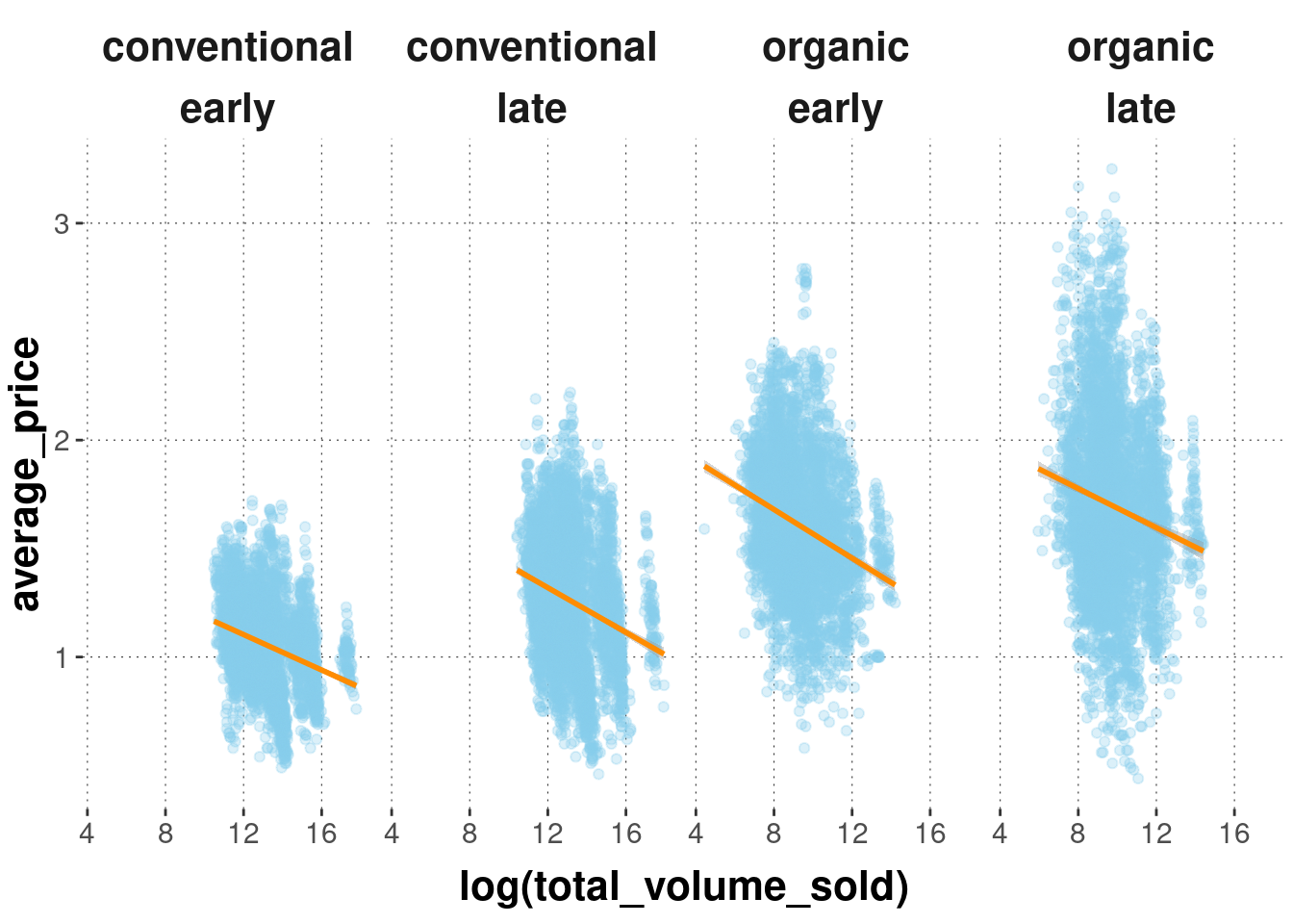
With facet_wrap it is possible to specify the desired number of columns or rows:
avocado_data_early_late %>%ggplot(aes(x =log(total_volume_sold), y = average_price)) +geom_point(alpha =0.3, color ="skyblue") +geom_smooth(method ="lm", color ="darkorange") +facet_wrap(type ~ early, nrow =1)