6.2 Visualization: the good, the bad and the infographic
Producing good data visualization is very difficult. There are no uncontroversial criteria for what a good visualization should be. There are, unfortunately, quite clear examples of really bad visualizations. We will look at some of these examples in the following.
An absolute classic on data visualization is an early book by Edward Tufte (1983) entitled “The Visual Display of Quantitative Information”. A distilled and over-simplified summary of Tufte’s proposal is that we should eliminate chart junk and increase the data-ink ratio, a concept which Tufte defines formally. The more information (= data) a plot conveys, the higher the data-ink ratio. The more ink it requires, the lower it is.
However, not all information in the data is equally relevant. Also, spending extra ink to reduce the recipient’s mental effort of retrieving the relevant information can be justified. Essentially, I would here propose to consider a special case of data visualization, common to scientific presentations. I want to speak of hypothesis-driven visualization as a way of communicating a clear message, the message we care most about at the current moment of (scientific) exchange. Though merely a special instance of all the goals one could pursue with data visualization, focusing on this special case is helpful because it allows us to formulate a (defeasible) rule of thumb for good visualization in analogy to how natural language ought to be used in order to achieve optimal cooperative information flow (at least as conceived by authors):
The vague & defeasible rule of thumb of good data visualization (according to the author).
“Communicate a maximal degree of relevant true information in a way that minimizes the recipient’s effort of retrieving this information.”
Interestingly, just like natural language also needs to rely on a conventional medium for expressing ideas which might put additional constraints on what counts as optimal communication (e.g., we might not be allowed to drop a pronoun in English even though it is clearly recoverable from the context, and Italian speakers would happily omit it), so do certain unarticulated conventions in each specific scientific field.26
Here are a few examples of bad plotting.27 To begin with, check out this fictitious data set:
large_contrast_data <- tribble(
  ~group, ~treatment, ~measurement,
  "A",    "on",       1000,
  "A",    "off",      1002,
  "B",    "on",       992,
  "B",    "off",      990
)
If we are interested in any potential influence of variables group and treatment on the measurement in question, the following graph is ruinously unhelpful because the large size of the bars renders the relatively small differences between them almost entirely unspottable.
large_contrast_data %>%
  ggplot(aes(x = group, y = measurement, fill = treatment)) +
  geom_bar(stat = "identity", position = "dodge")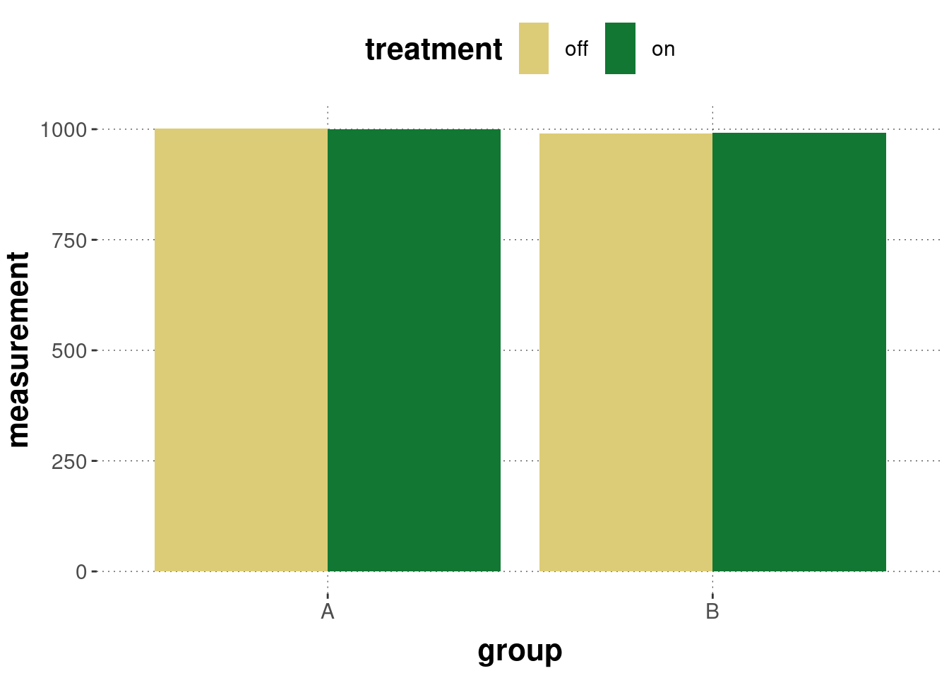
A better visualization would be this:
large_contrast_data %>%
  ggplot(aes(
    x = group,
    y = measurement,
    shape = treatment,
    color = treatment,
    group = treatment
    )
  ) +
  geom_point() +
  geom_line() +
  scale_y_continuous(breaks = scales::pretty_breaks())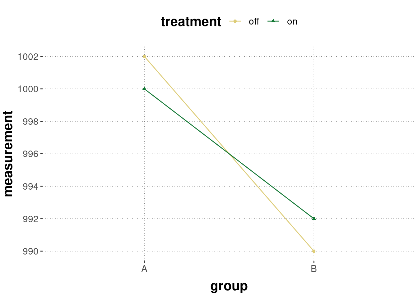
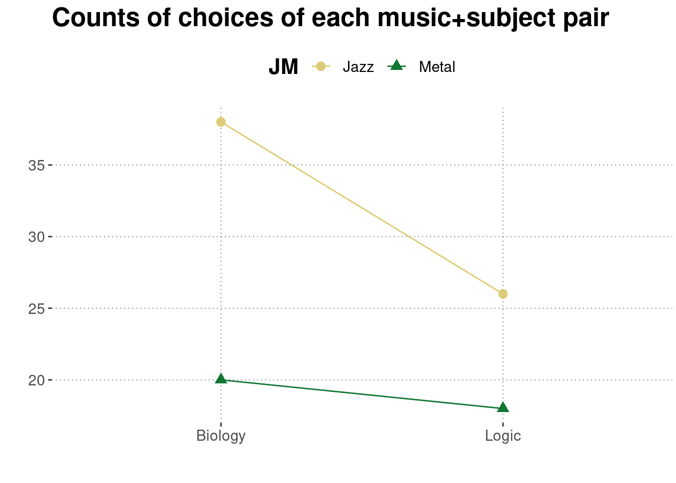
The following examples use the Bio-Logic Jazz-Metal data set, in particular the following derived table of counts or the derived table of proportions:
BLJM_associated_counts## # A tibble: 4 × 3
## JM LB n
## <chr> <chr> <int>
## 1 Jazz Biology 38
## 2 Jazz Logic 26
## 3 Metal Biology 20
## 4 Metal Logic 18It is probably hard to believe but Figure 6.2 was obtained without further intentional uglification just by choosing a default 3D bar plot display in Microsoft’s Excel. It does actually show the relevant information but it is entirely useless for a human observer without a magnifying glass, professional measuring tools and a calculator.
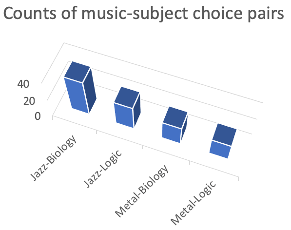
Figure 6.2: Example of a frontrunner for the prize of today’s most complete disaster in the visual communication of information.
It gets slightly better with the following pie chart of the same numerical information, also generated with Microsoft’s Excel. Subjectively, Figure 6.3 is pretty much anything but pretty. Objectively, it is better than the previous visualization in terms of 3D bar plots shown in Figure 6.2 but the pie chart is still not useful for answering the question which we care about, namely whether logicians are more likely to prefer Jazz over Metal than biologists.
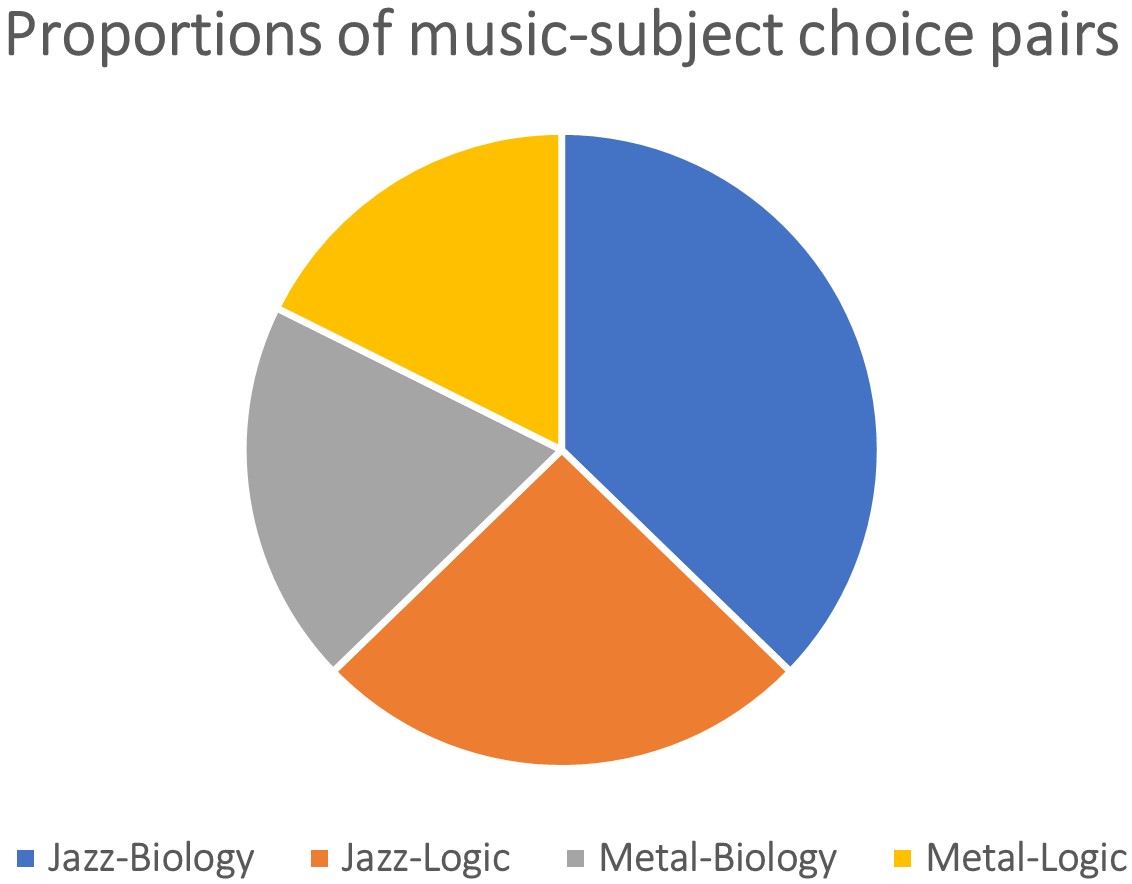
Figure 6.3: Example of a rather unhelpful visual representation of the BLJM data (when the research question is whether logicians are more likely to prefer Jazz over Metal than biologists).
We can produce a much more useful representation with the code below. (A similar visualization also appeared as Figure 5.1 in the previous chapter.)
BLJM_associated_counts %>%
  ggplot(
    aes(
      x = LB,
      y = n,
      color = JM,
      shape = JM,
      group = JM
    )
  ) +
  geom_point(size = 3) +
  geom_line() +
  labs(
    title = "Counts of choices of each music+subject pair",
    x = "",
    y = ""
  )
Infographics. Scientific communication with visualized data is different from other modes of communication with visualized data. These other contexts come with different requirements for good data visualization. Good examples of highly successful infographics are produced by the famous illustrator Nigel Holmes, for instance. Figure 6.4 is an example from Holmes’ website showing different amounts of energy consumption for different household appliances. The purpose of this visualization is not (only) to communicate information about which of the listed household appliances is most energy-intensive. Its main purpose is to raise awareness for the unexpectedly large energy consumption of household appliances in general (in standby mode).28
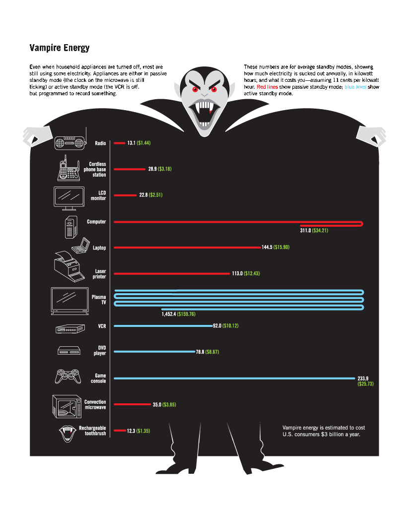
Figure 6.4: Example of an infographic. While possibly considered ‘chart junk’ in a scientific context, the eye-catching and highly memorable (and pretty!) artwork serves a strong secondary purpose in contexts other than scientific ones where hypothesis-driven precise communication with visually presented data is key.
References
If your community only understands scatter plots and bar plots, it will not help communication but only mark you as a pompous show-off if you communicate in any other way, no matter how much better you think this is.↩︎
For more disinspiration, see for example this curated list of delightfully bad visualizations from actual publications.↩︎
Image retrieved from Nigel Holmes’ website on November 25, 2019.↩︎