We can motivate the inclusion of group-level effects in terms of otherwise violated independence assumptions (the reaction times of a single individual are not necessarily independent of each other; some individuals are just slower or faster than others tout court). We can also motivate group-level effects by appeal to their effect of attenuating inference by flexibly weighing information from different groups. A good example of this latter effect arises when the number of observations in each group is not the same. Let’s go and explore!
Preamble
Here is code to load (and if necessary, install) required packages, and to set some global options (for plotting and efficient fitting of Bayesian models).
Toggle code
# install packages from CRAN (unless installed)pckgs_needed <-c("tidyverse","brms","rstan","rstanarm","remotes","tidybayes","bridgesampling","shinystan","mgcv")pckgs_installed <-installed.packages()[,"Package"]pckgs_2_install <- pckgs_needed[!(pckgs_needed %in% pckgs_installed)]if(length(pckgs_2_install)) {install.packages(pckgs_2_install)} # install additional packages from GitHub (unless installed)if (!"aida"%in% pckgs_installed) { remotes::install_github("michael-franke/aida-package")}if (!"faintr"%in% pckgs_installed) { remotes::install_github("michael-franke/faintr")}if (!"cspplot"%in% pckgs_installed) { remotes::install_github("CogSciPrag/cspplot")}# load the required packagesx <-lapply(pckgs_needed, library, character.only =TRUE)library(aida)library(faintr)library(cspplot)# these options help Stan run fasteroptions(mc.cores = parallel::detectCores())# use the CSP-theme for plottingtheme_set(theme_csp())# global color scheme from CSPproject_colors = cspplot::list_colors() |>pull(hex)# names(project_colors) <- cspplot::list_colors() |> pull(name)# setting theme colors globallyscale_colour_discrete <-function(...) {scale_colour_manual(..., values = project_colors)}scale_fill_discrete <-function(...) {scale_fill_manual(..., values = project_colors)}
Different ways to a mean
We will use the data set of (log) radon measurements that ships with the rstanarm package.
But should we not, somehow, also take into account that these measurements are from different counties? Okay, so let’s just calculate the mean log-radon measured for each county, and then take the mean of all those means:
Toggle code
# empirical mean of means: 1.38emp_mean_of_means <- data_radon |>group_by(county) |>summarize(mean_by_county =mean(log_radon)) |>ungroup() |>pull(mean_by_county) |>mean()emp_mean_of_means
[1] 1.37991
Aha! There is a difference between the empirical mean (sample mean; mean of all data points) and the mean-of-means (a.k.a., grand mean). This is because there are different numbers of observations for each county:
# A tibble: 85 x 3
   county    mean_by_county n_obs_by_county
   <fct>              <dbl>           <int>
 1 AITKIN             0.715               4
 2 ANOKA              0.891              52
 3 BECKER             1.09                3
 4 BELTRAMI           1.19                7
 5 BENTON             1.28                4
 6 BIGSTONE           1.54                3
 7 BLUEEARTH          1.93               14
 8 BROWN              1.65                4
 9 CARLTON            0.977              10
10 CARVER             1.22                6
# i 75 more rows
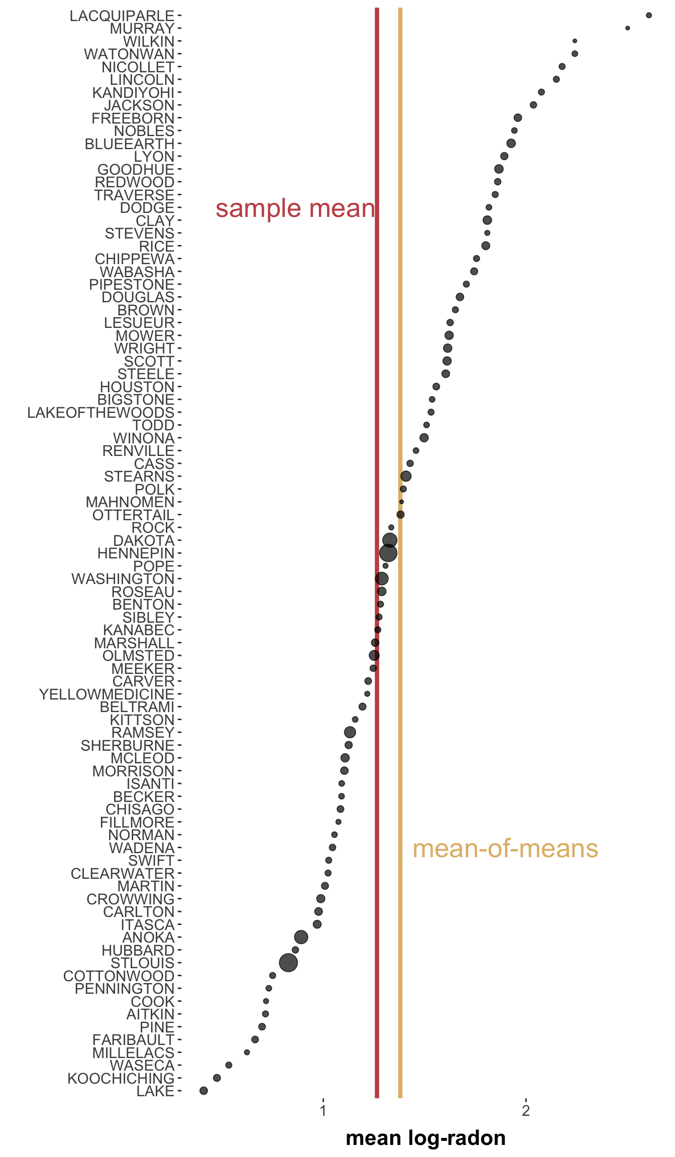
The sample mean does not distinguish at all which observation came from which county. The mean-of-means, on the other hand, puts “counties first”, so to speak, and does not acknowledge that the number of observations each county contributed might be different. To understand how this can yield a difference, look at this picture:
Toggle code
data_radon |>group_by(county) |>summarize(mean_by_county =mean(log_radon),n_obs_by_county =n()) |>mutate(county =fct_reorder(county, mean_by_county)) |>ggplot(aes(x = mean_by_county, y = county)) +theme(legend.position="none") +xlab("mean log-radon") +ylab("") +geom_vline(aes(xintercept = empirical_mean), color = project_colors[2], size =1.5) +geom_vline(aes(xintercept = emp_mean_of_means), color = project_colors[3], size =1.5) +geom_point(aes(size = n_obs_by_county), alpha =0.7) +annotate("text", x = empirical_mean -0.4, y =70, label ="sample mean", color = project_colors[2], size =7) +annotate("text", x = emp_mean_of_means +0.52, y =20, label ="mean-of-means", color = project_colors[3], size =7) +theme(panel.grid.major =element_blank(), panel.grid.minor =element_blank())
The \(x\)-position of the dots represents the mean for each county. The size of the dots represents the number of observations for each county. The sample mean (in red) is lower because some “heavier dots pull it to the left”. Reversely, the mean-of-means (in yellow) is “pulled more towards the right by the lighter dots” (since it doesn’t care about the size of the dots).
Which measure is correct? Neither! Or better: both! Or actually: it depends … on what we want. But actually: maybe we should let the data decide.
Group-level effects as smoothing terms
Suppose we want a Bayesian measure (with quantified uncertainty) of the sample mean and the mean-of-means, how would we do it? (Maybe you want to think about this for a moment, before you uncover the solution below!)
Exercise
Retrieve a Bayesian estimate of the sample mean and of the mean-of-means for the log-randon measure.
Solution
The sample mean is estimable with an intercept-only model.
# A tibble: 1 x 4
  Parameter   `|95%`  mean `95%|`
  <chr>        <dbl> <dbl>  <dbl>
1 sample mean   1.21  1.26   1.32
The mean-of-means can be estimated by running a regression model with county as population-level effect.
Toggle code
# We need quite high iterations for this to fit properly # (likely to do the few observations in many of the groups).fit_FE <- brms::brm(formula = log_radon ~ county,prior =prior(student_t(1,0,10)),iter =20000,thin =5,data = data_radon)
This model yields estimates for the mean of each county. (There is some data wrangling to do to get at them, given the way categorical factors are treated internally, but that is a different matter). If we average the estimates properly (here using helper functions from the faintr package), we get an estimate of the mean-of-means:
Toggle code
# estimated sample mean: 1.381meanOmean_estimate <-# obtain samples from the grand mean faintr::filter_cell_draws(fit_FE, colname ="draws") |>pull(draws) |># summarize them aida::summarize_sample_vector(name ="mean-of-means")rbind(sample_mean_estimate, meanOmean_estimate)
# A tibble: 2 x 4
  Parameter     `|95%`  mean `95%|`
  <chr>          <dbl> <dbl>  <dbl>
1 sample mean     1.21  1.26   1.32
2 mean-of-means   1.30  1.38   1.46
In between these two options (no county variable vs. county as a population-level effect), there is a middle path: treating county as a group-level random intercept.
# A tibble: 3 x 4
  Parameter     `|95%`  mean `95%|`
  <chr>          <dbl> <dbl>  <dbl>
1 sample mean     1.21  1.26   1.32
2 mean-of-means   1.30  1.38   1.46
3 pooled mean     1.25  1.35   1.44
This estimate is nuanced. It does take all data points into account (unlike the mean-of-mean). But (unlike the sample mean), it does weigh some data observations more heavily than others. In particular, counties with few but extreme observations receive, so to speak, less attention because “we explain away these observations as flukes for a given county”. In other words, we can think of group-level modeling also as a way of regularizing inference to differentially weigh observations, depending on which group they originated from.
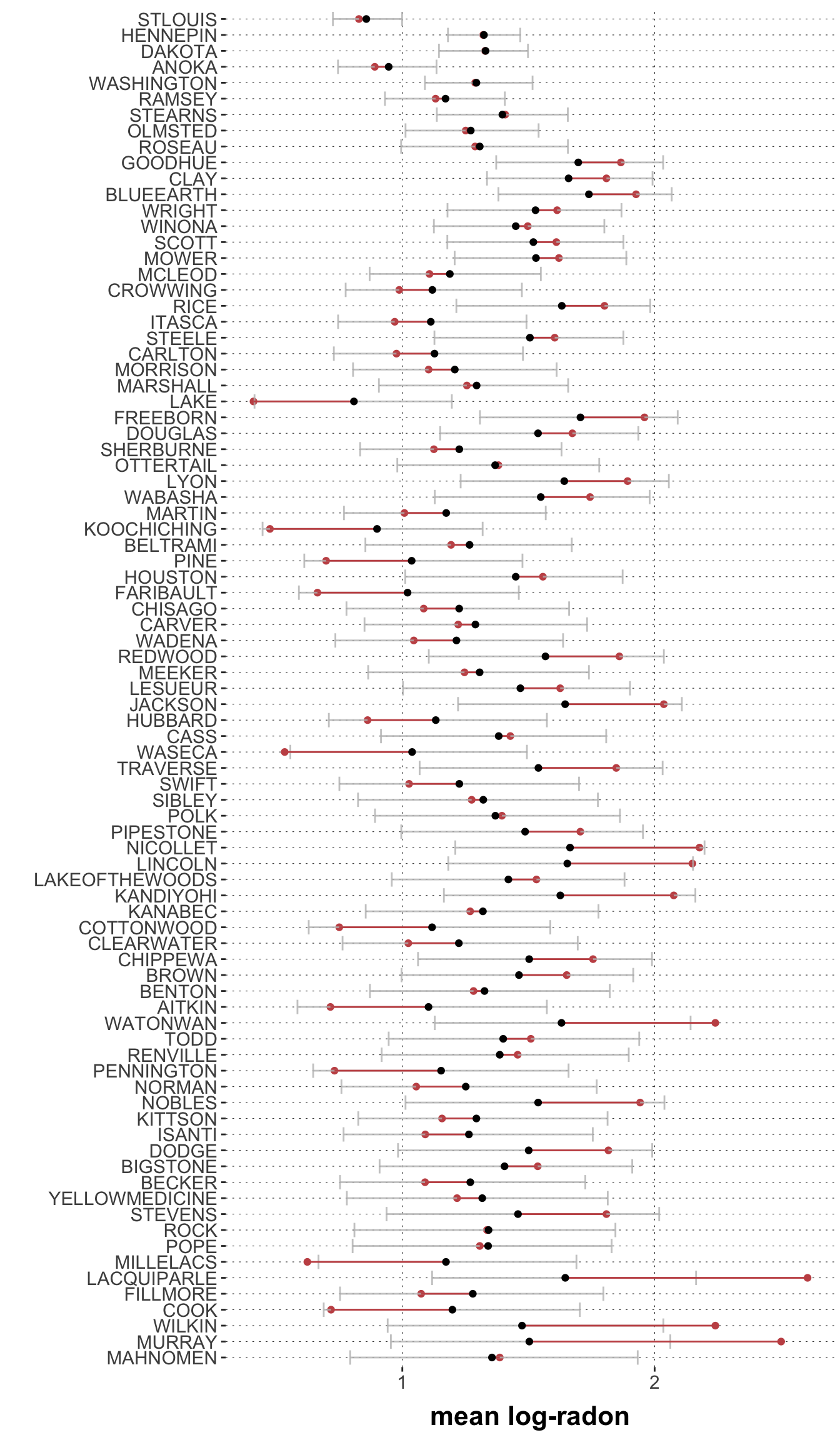
Okay, this may sound like a plausible rationalization of what one could do, but how do we know that the model actually behaves in this way? – By looking at what the model would predict for different counties. So, here is a plot of the a posteriori expected measurement for each county (ordered by size) together with the empirically observed mean-by-county:
This graph shows the counties on the \(y\)-axis, ordered number of observation from highest on the top to lowest on the bottom. The black dots are the means of the posterior predictive for each county (the gray error bars are 95% credible intervals for these estimates. The red dots are the empirically observed means for each county (the red lines indicating the differences between prediction and observation for each county).
This graph shows:
The higher the number of observations, the less uncertainty about the prediction.
The higher the number of observations, the less difference between prediction and observation.
It is the latter observation that lends credence to the interpretation above: the effect of random effects is differential weighing of observations in a data-driven manner; low certainty cases receive less weight, as they should.