Wrangling & plotting

Bayesian regression: theory & practice

Author

Michael Franke & Timo Roettger

Preamble

Here is code to load (and if necessary, install) required packages, and to set some global options (for plotting and efficient fitting of Bayesian models).

Toggle code
# install packages from CRAN (unless installed)
pckgs_needed <- c(
  "tidyverse",
  "brms",
  "rstan",
  "rstanarm",
  "remotes",
  "tidybayes",
  "bridgesampling",
  "shinystan",
  "mgcv"
)
pckgs_installed <- installed.packages()[,"Package"]
pckgs_2_install <- pckgs_needed[!(pckgs_needed %in% pckgs_installed)]
if(length(pckgs_2_install)) {
  install.packages(pckgs_2_install)
} 

# install additional packages from GitHub (unless installed)
if (! "aida" %in% pckgs_installed) {
  remotes::install_github("michael-franke/aida-package")
}
if (! "faintr" %in% pckgs_installed) {
  remotes::install_github("michael-franke/faintr")
}
if (! "cspplot" %in% pckgs_installed) {
  remotes::install_github("CogSciPrag/cspplot")
}

# load the required packages
x <- lapply(pckgs_needed, library, character.only = TRUE)
library(aida)
library(faintr)
library(cspplot)

# these options help Stan run faster
options(mc.cores = parallel::detectCores())

# use the CSP-theme for plotting
theme_set(theme_csp())

# global color scheme from CSP
project_colors = cspplot::list_colors() |> pull(hex)
# names(project_colors) <- cspplot::list_colors() |> pull(name)

# setting theme colors globally
scale_colour_discrete <- function(...) {
  scale_colour_manual(..., values = project_colors)
}
scale_fill_discrete <- function(...) {
   scale_fill_manual(..., values = project_colors)
}

Exploring the data set

Let’s first explore the data set which we will be using during the course. It is rich and fun.

We will be analyzing data from Experiment 1 of the following paper:

Scherbaum, S., & Kieslich, P. J. (2018). Stuck at the starting line: How the starting procedure influences mouse-tracking data. Behavior Research Methods, 50(5), 2097-2110.

https://osf.io/7vrkz/

It’s a methodological paper but it replicates a very intuitive finding. When you are categorizing animals into types (e.g. a ‘dog’ into the type ‘mammal’), you perform better when the animal is prototypical (dog --> mammal) as opposed to atypical (dolphin --> mammal). This ‘performing better’ is measured in different ways: reaction time, accuracy (correct vs. incorrect) and several measurement of the cursor movement toward the correct answer.

Loading and inspecting the data

The data is part of the aida package, but we can give it a fancy new name:

Toggle code
dolphin <- aida::data_MT

To get some information about the data set, we can use the help function:

Toggle code
help("data_MT")

Here is some more information we can get about the data:

Toggle code
# number of rows in the data set
nrow(dolphin)
[1] 2052
Toggle code
# number of columns in the data set
ncol(dolphin)
[1] 16
Toggle code
# names of the columns
names(dolphin)
 [1] "X1"               "trial_id"         "MAD"              "AUC"             
 [5] "xpos_flips"       "RT"               "prototype_label"  "subject_id"      
 [9] "group"            "condition"        "exemplar"         "category_left"   
[13] "category_right"   "category_correct" "response"         "correct"         
Toggle code
# number of unique `subject_id`s
dolphin$subject_id |> unique() |> length()
[1] 108
Toggle code
# number of types each subject saw different `conditions`
dolphin |> with(table(subject_id, condition)) |> head()
          condition
subject_id Atypical Typical
      1001        6      13
      1002        6      13
      1003        6      13
      1004        6      13
      1005        6      13
      1006        6      13

A closer look at the columns

Let’s take a closer look at the columns and the information inside them.

We can get a glimpse of all columns like so:

Toggle code
glimpse(dolphin)
Rows: 2,052
Columns: 16
$ X1               <dbl> 1, 2, 3, 4, 5, 6, 7, 8, 9, 10, 11, 12, 13, 14, 15, 16~
$ trial_id         <chr> "id0001", "id0002", "id0003", "id0004", "id0005", "id~
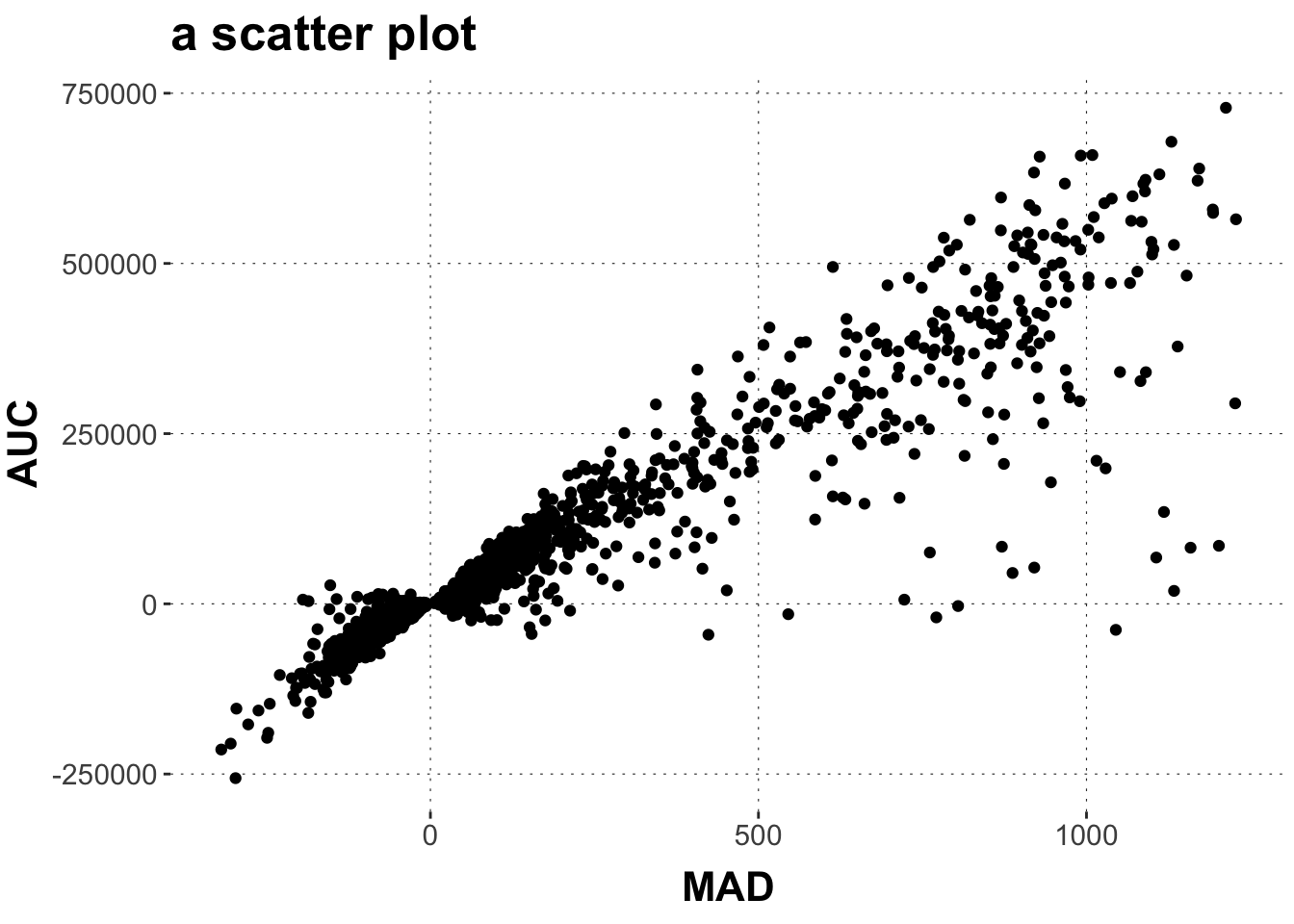
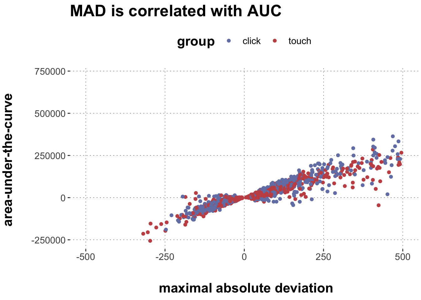
$ MAD              <dbl> 82.53319, 44.73484, 283.48207, 138.94863, 401.93988, ~
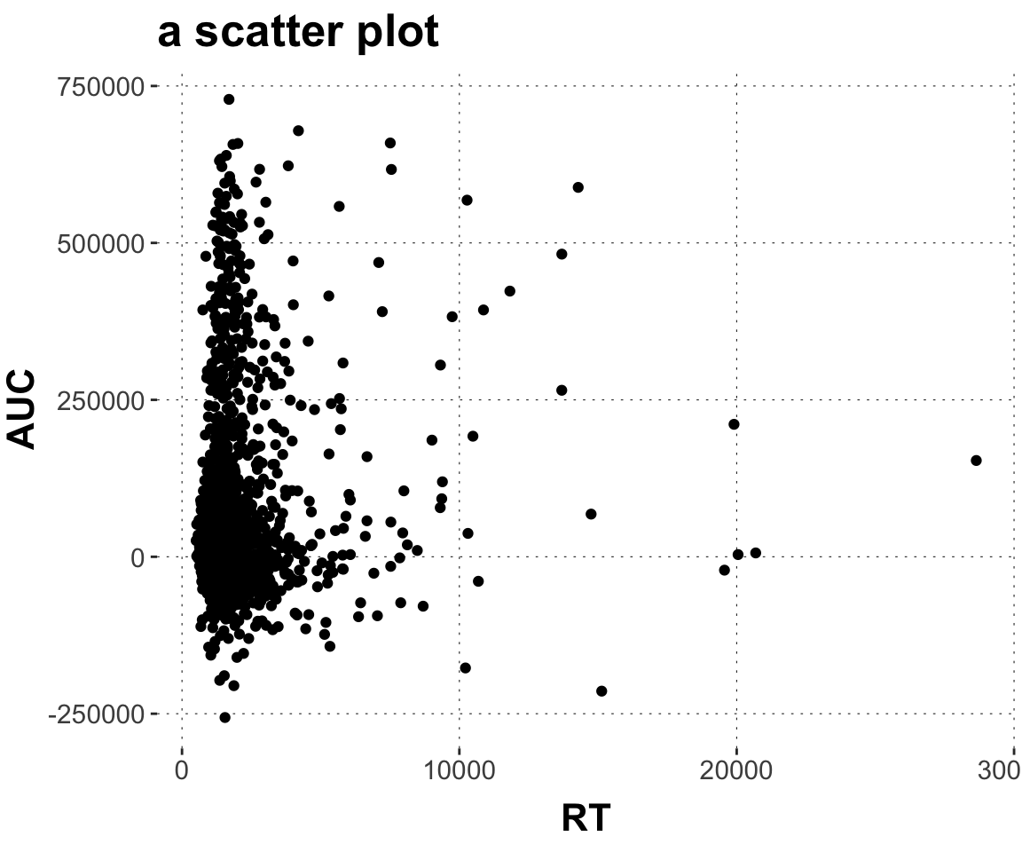
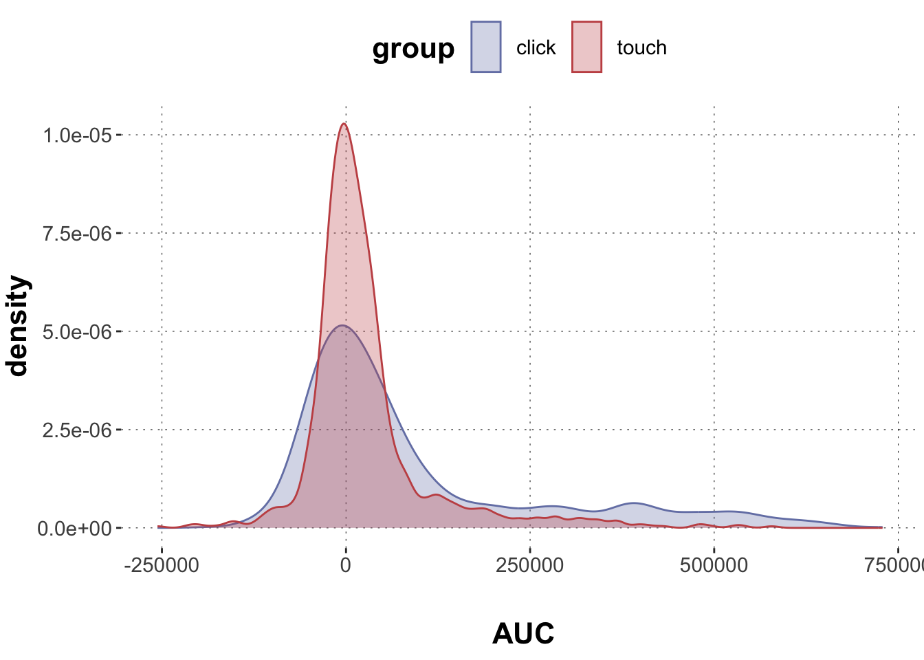
$ AUC              <dbl> 40169.5, 13947.0, 84491.5, 74084.0, 223083.0, 308376.~
$ xpos_flips       <dbl> 3, 1, 2, 0, 2, 2, 1, 0, 2, 0, 2, 2, 0, 0, 3, 1, 0, 1,~
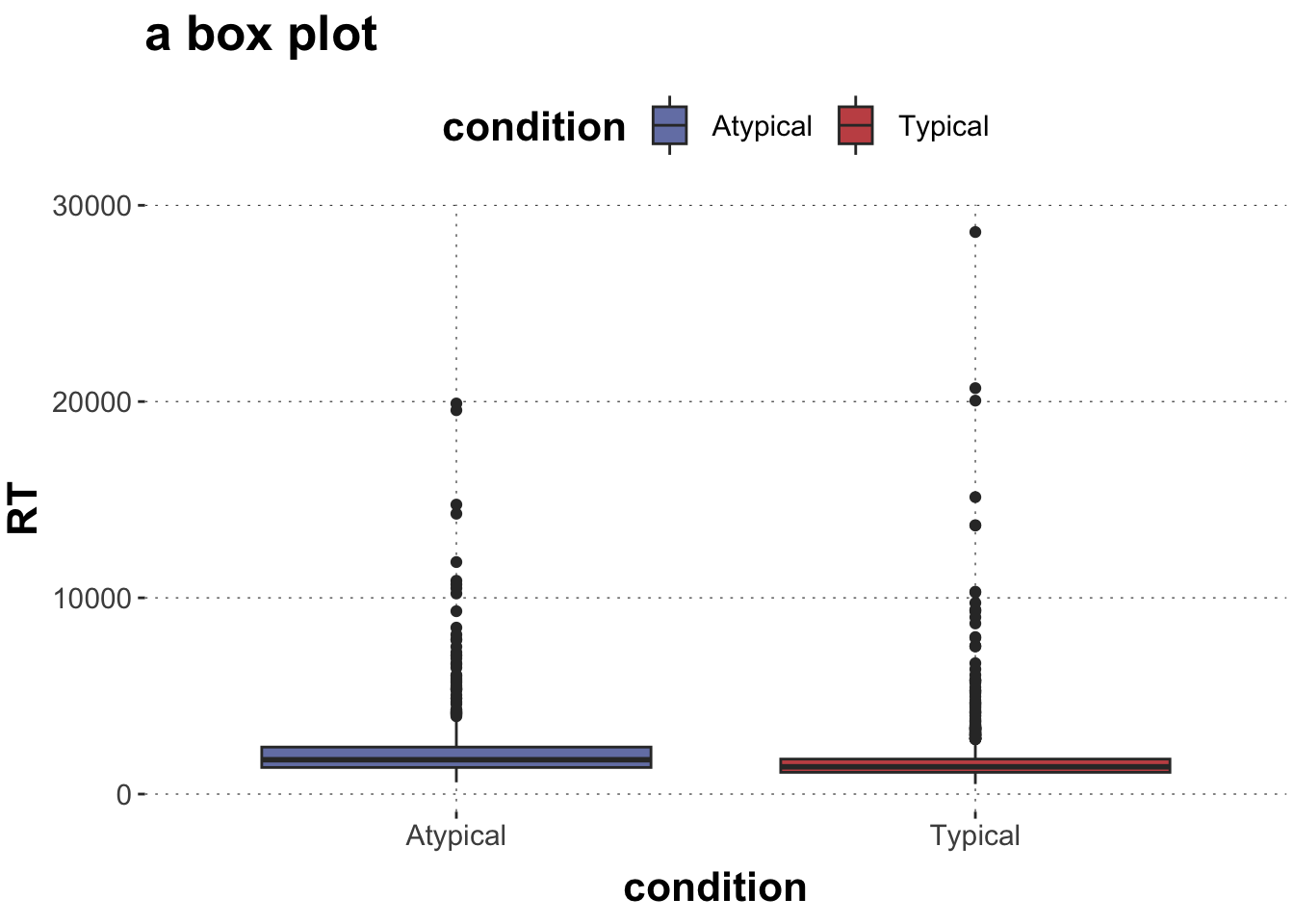
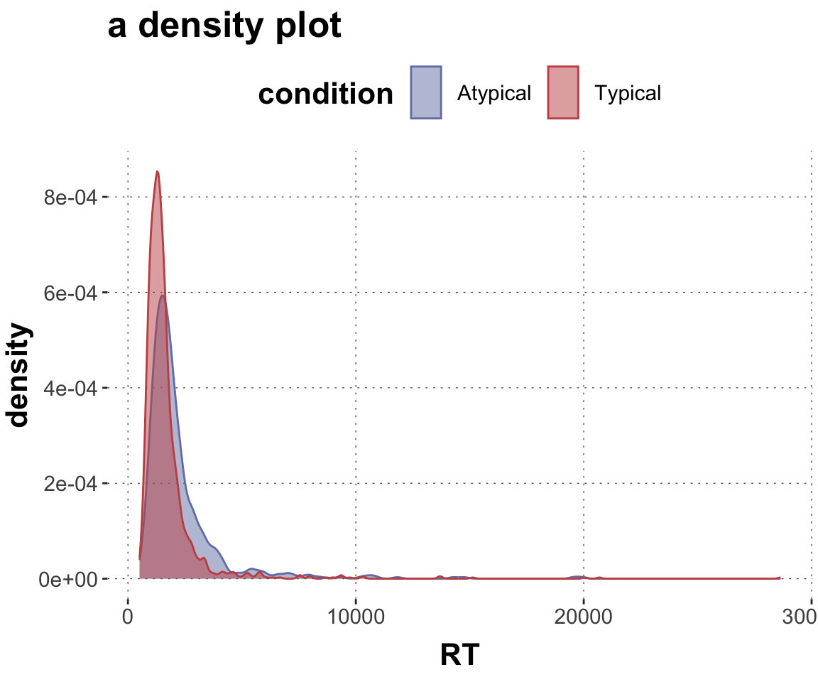
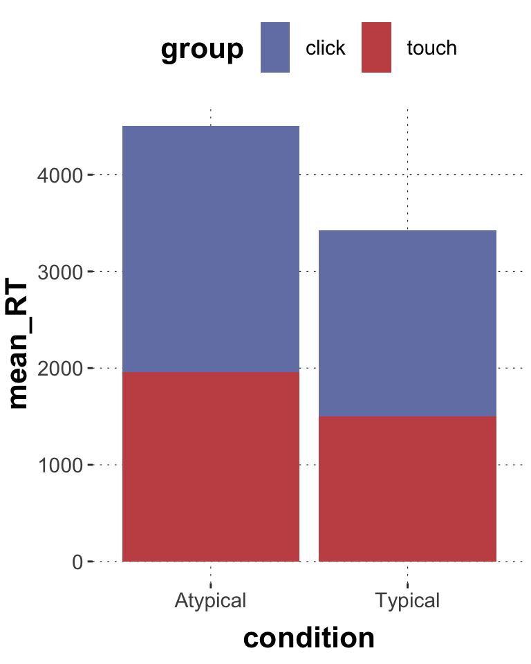
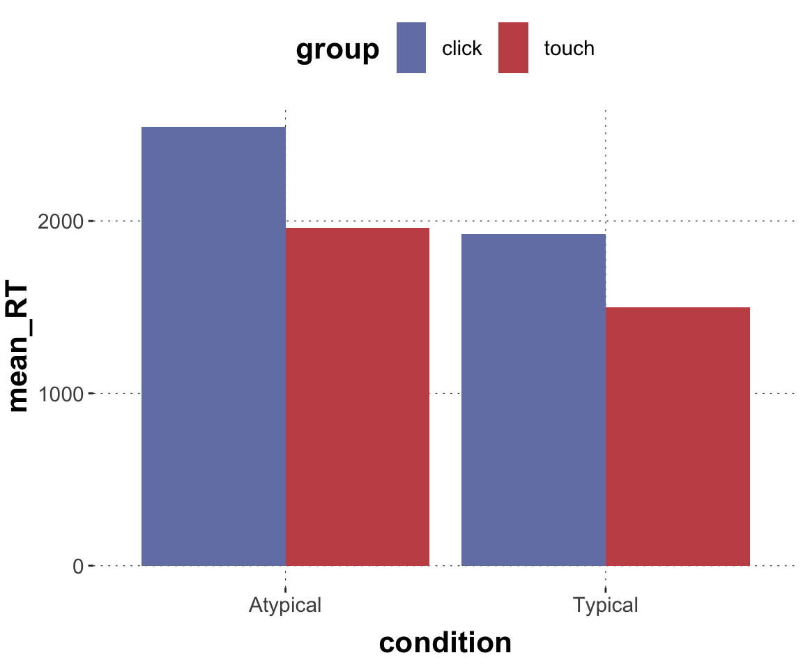
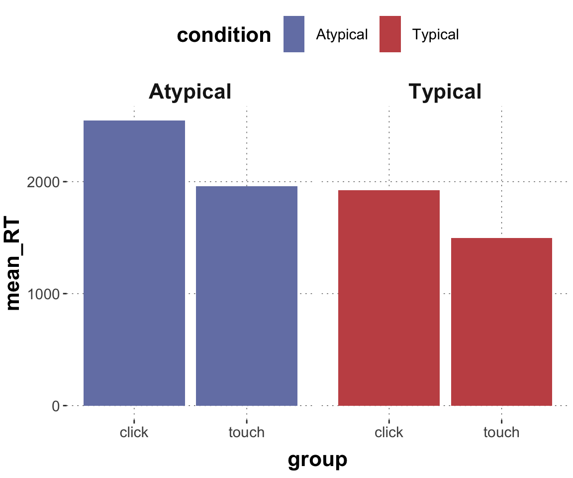
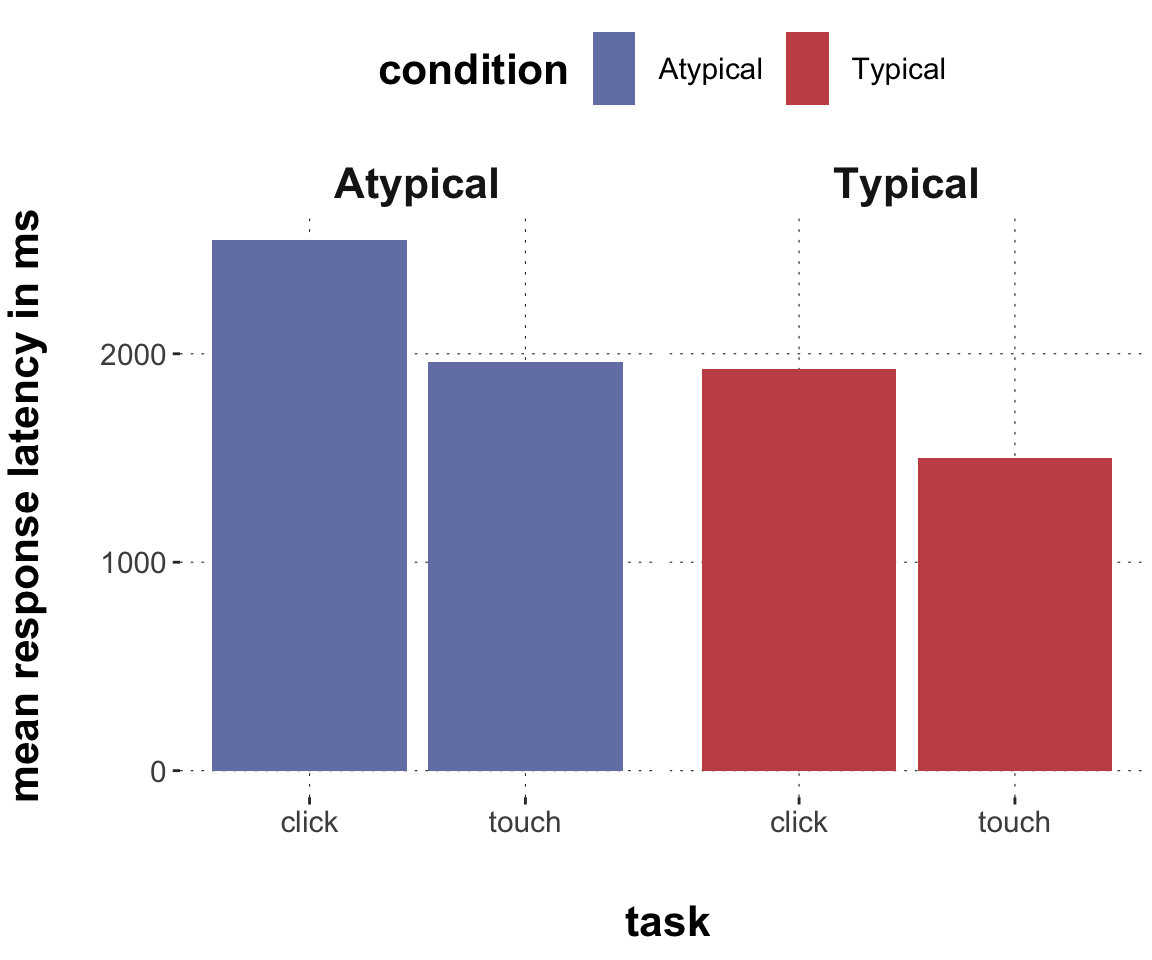
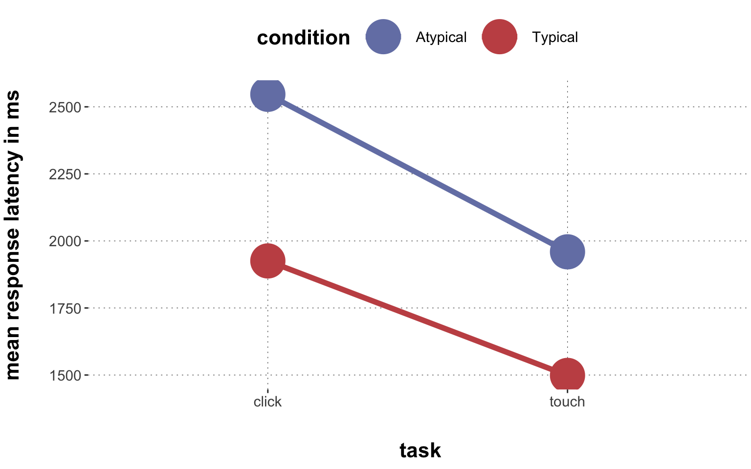
$ RT               <dbl> 950, 1251, 930, 690, 951, 1079, 1050, 830, 700, 810, ~
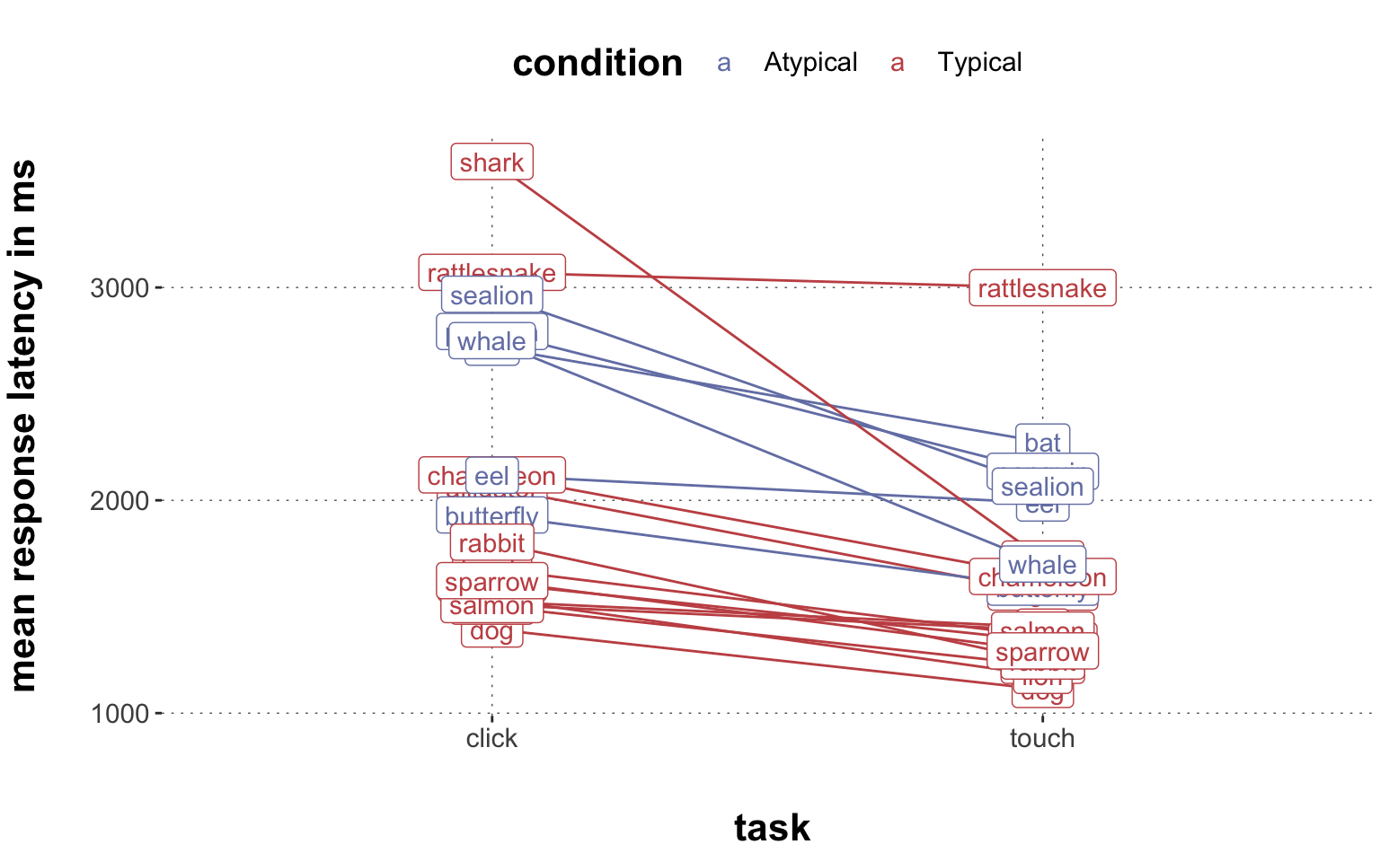
$ prototype_label  <chr> "straight", "straight", "curved", "curved", "cCoM", "~
$ subject_id       <dbl> 1001, 1001, 1001, 1001, 1001, 1001, 1001, 1001, 1001,~
$ group            <chr> "touch", "touch", "touch", "touch", "touch", "touch",~
$ condition        <chr> "Atypical", "Typical", "Atypical", "Atypical", "Typic~
$ exemplar         <chr> "eel", "rattlesnake", "bat", "butterfly", "hawk", "pe~
$ category_left    <chr> "fish", "amphibian", "bird", "Insekt", "bird", "fish"~
$ category_right   <chr> "reptile", "reptile", "mammal", "bird", "reptile", "b~
$ category_correct <chr> "fish", "reptile", "mammal", "Insekt", "bird", "bird"~
$ response         <chr> "fish", "reptile", "bird", "Insekt", "bird", "bird", ~
$ correct          <dbl> 1, 1, 0, 1, 1, 1, 1, 1, 1, 1, 1, 0, 1, 1, 1, 1, 0, 1,~

Here is a quick explanation of all the different columns:

  • trial_id = unique id for individual trials
  • MAD = maximal deviation into competitor space
  • AUC = area under the curve
  • xpos_flips = the amount of horizontal direction changes
  • RT = reaction time in ms
  • prototype_label = different categories of prototypical movement strategies
  • subject_id = unique id for individual participants
  • group = groups differ in the response design (click vs. touch)
  • condition = category membership (Typical vs. Atypical)
  • exemplar = the concrete animal
  • category_left = the category displayed on the left
  • category_right = the category displayed on the right
  • category_correct= the category that is correct
  • response = the selected category
  • correct = whether or not the response matches category_correct

Some basic data wrangling

Although the data set is already in good shape, here are some excursions into common steps to wrangle data (select, filter, reshape, summarize …).

Selecting columns

For now, we are only interested in columns RT, group, condition, category_correct, and correct. We can use the select() function of dplyr to get rid of columns we don’t need.

Toggle code
# selecting specific columns
dolphin_selected <-
  dolphin |>
  dplyr::select(RT, group, condition, category_correct, correct)
 
# let's have a look
dolphin_selected
# A tibble: 2,052 x 5
      RT group condition category_correct correct
   <dbl> <chr> <chr>     <chr>              <dbl>
 1   950 touch Atypical  fish                   1
 2  1251 touch Typical   reptile                1
 3   930 touch Atypical  mammal                 0
 4   690 touch Atypical  Insekt                 1
 5   951 touch Typical   bird                   1
 6  1079 touch Atypical  bird                   1
 7  1050 touch Typical   fish                   1
 8   830 touch Typical   fish                   1
 9   700 touch Typical   mammal                 1
10   810 touch Typical   fish                   1
# i 2,042 more rows

Filtering rows

If we care only about a subset of rows, we can use the filter() function. For example, let’s filter all trials in which the correct category was either a fish or a mammal

Toggle code
dolphin_filter1 <-
  dolphin_selected |> 
  filter(category_correct == "fish" | category_correct == "mammal")
  # the | is a logical operator that indicates that either the first expression OR 
  # the second one has to be true

dolphin_filter1
# A tibble: 1,296 x 5
      RT group condition category_correct correct
   <dbl> <chr> <chr>     <chr>              <dbl>
 1   950 touch Atypical  fish                   1
 2   930 touch Atypical  mammal                 0
 3  1050 touch Typical   fish                   1
 4   830 touch Typical   fish                   1
 5   700 touch Typical   mammal                 1
 6   810 touch Typical   fish                   1
 7  1264 touch Typical   mammal                 1
 8   890 touch Atypical  mammal                 0
 9  1040 touch Typical   mammal                 1
10   730 touch Typical   mammal                 1
# i 1,286 more rows

You can also filter() against particular conditions. For example, let’s filter all rows that do not have bird as their correct category:

Toggle code
dolphin_filter2 <-
  dolphin_selected |> 
  filter(category_correct != "bird")

dolphin_filter2
# A tibble: 1,728 x 5
      RT group condition category_correct correct
   <dbl> <chr> <chr>     <chr>              <dbl>
 1   950 touch Atypical  fish                   1
 2  1251 touch Typical   reptile                1
 3   930 touch Atypical  mammal                 0
 4   690 touch Atypical  Insekt                 1
 5  1050 touch Typical   fish                   1
 6   830 touch Typical   fish                   1
 7   700 touch Typical   mammal                 1
 8   810 touch Typical   fish                   1
 9  1264 touch Typical   mammal                 1
10   890 touch Atypical  mammal                 0
# i 1,718 more rows

We can also filter according to multiple conditions at once, including numeric conditions. Here, we also filter for trials that have correct responses.

Toggle code
dolphin_filter3 <-
  dolphin_selected |> 
  filter(category_correct != "bird",
         correct == 1)

dolphin_filter3
# A tibble: 1,602 x 5
      RT group condition category_correct correct
   <dbl> <chr> <chr>     <chr>              <dbl>
 1   950 touch Atypical  fish                   1
 2  1251 touch Typical   reptile                1
 3   690 touch Atypical  Insekt                 1
 4  1050 touch Typical   fish                   1
 5   830 touch Typical   fish                   1
 6   700 touch Typical   mammal                 1
 7   810 touch Typical   fish                   1
 8  1264 touch Typical   mammal                 1
 9  1040 touch Typical   mammal                 1
10   730 touch Typical   mammal                 1
# i 1,592 more rows

Grouping and summarizing

We can also generate summary statistics of certain variables with a combination of group_by() & summarise(). Let’s get the means and standard deviations of the reactions times for each level in the variable condition. We also include the minimum and maximum values for each condition.

Toggle code
dolphin_aggregate <-
  dolphin_filter3 |>
  group_by(condition) |>
  summarise(
    min_RT  = min(RT),
    mean_RT = mean(RT, na.rm = T),
    sd_RT   = sd(RT, na.rm = T),
    max_RT  = max(RT)
    )
  # the na.rm = T is an argument that is used to tell R that NAs should be ignored 
  # when calculating the summary statistics

# show the aggregated df
dolphin_aggregate
# A tibble: 2 x 5
  condition min_RT mean_RT sd_RT max_RT
  <chr>      <dbl>   <dbl> <dbl>  <dbl>
1 Atypical     630   2149. 1840.  19903
2 Typical      510   1665. 1283.  20685

So we find that atypical categories are responded to slower than typical categories. Makes sense. Identifying a dolphin as a mammal might be difficult because it shares a lot of features with fish.

We can group according to many different factors simultaneously, and we can create multiple summary statistics at the same time. Here, we get summary statistics for each combination of all levels in variables condition and group. We use the tidyboot package to get bootstrapped 95% confidence intervalls. (Notice that these are more informative than standard deviations in the sense that they give an upper and lower deviation, not just one number for both directions, which can be misleading when the data is skewed (like reaction times typically are)):

Toggle code
dolphin_aggregate2 <-
  dolphin_filter3 |>
  group_by(group, condition) |>
  summarize(
    lower_CI = tidyboot::ci_lower(RT),
    mean_RT  = mean(RT, na.rm = T),
    upper_CI = tidyboot::ci_upper(RT)
    )

# show the aggregated df
dolphin_aggregate2
# A tibble: 4 x 5
# Groups:   group [2]
  group condition lower_CI mean_RT upper_CI
  <chr> <chr>        <dbl>   <dbl>    <dbl>
1 click Atypical     1030.   2417.    7311.
2 click Typical       950    1847.    4698.
3 touch Atypical      750    1900.    5368.
4 touch Typical       686.   1486.    3955.

We can see here that the group that needed to click on a response are overall slower than touch responses, but also much more variable in their behavior.

Changing and adding columns

Often, we are interested in standardized measures because we do not know what a value of 1 means on any given scale. Is 1 a large difference or a small difference? For example when we want to explore the impact of several predictors on the same measurement, we want to know the relative size of a number. To achieve this, we standardize measures by dividing their mean by their respective standard deviations. We will use the scale() function for this and create a new variable in our data frame via mutate().

(Note that the scale() function creates an object that is of the matrix class. That is fine for the most part but might create issues later on. To avoid any issues, we wrap the scale() function in as.numeric() to store the results as a numeric vector.)

Toggle code
dolphin_standardize <-
  dolphin_selected |>
  mutate(RT_scale = as.numeric(scale(RT)))
  
head(dolphin_standardize)
# A tibble: 6 x 6
     RT group condition category_correct correct RT_scale
  <dbl> <chr> <chr>     <chr>              <dbl>    <dbl>
1   950 touch Atypical  fish                   1   -0.552
2  1251 touch Typical   reptile                1   -0.373
3   930 touch Atypical  mammal                 0   -0.564
4   690 touch Atypical  Insekt                 1   -0.706
5   951 touch Typical   bird                   1   -0.551
6  1079 touch Atypical  bird                   1   -0.475

If we now compare, say atypical and typical categories according to reaction times, we can use the standardized RT ratings. Let’s do all of this in one “pipeline”.

Toggle code
dolphin_agg_standardize <- dolphin_selected |>
  mutate(RT_scale = scale(RT)) |> 
  group_by(condition) |>
  summarise(mean_RT_scale = mean(RT_scale, na.rm = T))
  
head(dolphin_agg_standardize)
# A tibble: 2 x 2
  condition mean_RT_scale
  <chr>             <dbl>
1 Atypical          0.219
2 Typical          -0.101

Now we can see that atypical categories exhibit relatively higher RTs, i.e., more than 0.3 standard deviations higher than for typical categories.

Exercises for data wrangling

Exercise 1

Exercise 1a

Take the dolphin data set and store a reduced variant of it as dolphin_reduced. The new data frame should contain only the following columns: RT, AUC, group, and exemplar.

Toggle code
dolphin_reduced <- dolphin |>
  select(RT, AUC, group, exemplar)

head(dolphin_reduced)
# A tibble: 6 x 4
     RT     AUC group exemplar   
  <dbl>   <dbl> <chr> <chr>      
1   950  40170. touch eel        
2  1251  13947  touch rattlesnake
3   930  84492. touch bat        
4   690  74084  touch butterfly  
5   951 223083  touch hawk       
6  1079 308376  touch penguin    
Exercise 1b

We are for now only interested in those data that have whales as the exemplar. filter() only those rows and store them in a new dataframe called whales_only.

Toggle code
whales_only <- dolphin_reduced |> 
  filter(exemplar == "whale")

head(whales_only)
# A tibble: 6 x 4
     RT     AUC group exemplar
  <dbl>   <dbl> <chr> <chr>   
1   760  13498  touch whale   
2  1990  42404  click whale   
3  3613 -10167  click whale   
4  2030 162678  touch whale   
5  1490  54054  touch whale   
6  1305  74222. touch whale   
Exercise 1c

Now filter for only those data that have RTs below 1500ms.

Toggle code
whales_only2 <- whales_only |> 
  filter(RT < 1500)

head(whales_only2)
# A tibble: 6 x 4
     RT     AUC group exemplar
  <dbl>   <dbl> <chr> <chr>   
1   760  13498  touch whale   
2  1490  54054  touch whale   
3  1305  74222. touch whale   
4  1350   -643  touch whale   
5  1040  19426. touch whale   
6  1141 -44260. click whale   
Exercise 1d

We don’t like that AUC is unstandardized. Use mutate() to create a new vector that represents scaled AUC values (scaling is achieved by the function scale()).

Toggle code
whales_only_scaled <- whales_only2 |> 
  mutate(AUC_scaled = scale(AUC))

head(whales_only_scaled)
# A tibble: 6 x 5
     RT     AUC group exemplar AUC_scaled[,1]
  <dbl>   <dbl> <chr> <chr>             <dbl>
1   760  13498  touch whale           -0.456 
2  1490  54054  touch whale           -0.212 
3  1305  74222. touch whale           -0.0912
4  1350   -643  touch whale           -0.541 
5  1040  19426. touch whale           -0.420 
6  1141 -44260. click whale           -0.803 
Exercise 1e

Calculate the mean scaled AUC ratings for both both groups.

Toggle code
whales_aggregate <- whales_only_scaled |> 
  group_by(group) |> 
  summarise(mean_AUC_scaled = mean(AUC_scaled, na.rm =TRUE))

head(whales_aggregate)
# A tibble: 2 x 2
  group mean_AUC_scaled
  <chr>           <dbl>
1 click           0.798
2 touch          -0.372
Exercise 1f

Do all of the above (a-e) in one pipeline.

Toggle code
whales_aggregate <- dolphin |>
  select(RT, AUC, group, exemplar) |> 
  filter(exemplar == "whale",
         RT < 1500) |> 
  mutate(AUC_scaled = scale(AUC)) |> 
  group_by(group) |> 
  summarise(mean_AUC_scaled = mean(AUC_scaled, na.rm =TRUE))
  
head(whales_aggregate)
# A tibble: 2 x 2
  group mean_AUC_scaled
  <chr>           <dbl>
1 click           0.798
2 touch          -0.372

Exercise 2

Exercise 2a

Take the dolphin data set and store a reduced variant of it. The new data frame should contain only the columns condition, group, and xpos_flips, correct. And within the correct vector, we are only interested in the correct trials (= 1). Filter accordingly.

Toggle code
dolphin_sub <- dolphin |> 
  select(condition, group, xpos_flips, correct) |> 
  filter(correct == 1)

head(dolphin_sub)
# A tibble: 6 x 4
  condition group xpos_flips correct
  <chr>     <chr>      <dbl>   <dbl>
1 Atypical  touch          3       1
2 Typical   touch          1       1
3 Atypical  touch          0       1
4 Typical   touch          2       1
5 Atypical  touch          2       1
6 Typical   touch          1       1
Exercise 2b

Create an aggregated data frame that contains the mean xpos_flips value and the standard deviation for group and condition.

Toggle code
dolphin_agg <- dolphin_sub |>
  group_by(group, condition) |> 
  summarise(mean_xpos_flips = mean(xpos_flips, na.rm = TRUE),
            sd_xpos_flips = sd(xpos_flips, na.rm = TRUE))

head(dolphin_agg)
# A tibble: 4 x 4
# Groups:   group [2]
  group condition mean_xpos_flips sd_xpos_flips
  <chr> <chr>               <dbl>         <dbl>
1 click Atypical            1.33          1.23 
2 click Typical             0.956         1.05 
3 touch Atypical            0.797         1.10 
4 touch Typical             0.572         0.938
Exercise 2c

Use the rename() function to rename the new vectors for the mean xflips and their standard deviation to xflips_mean and xflips_sd.

Toggle code
dolphin_agg2 <- dolphin_agg |>
  rename(xflips_mean = mean_xpos_flips,
         xflips_sd = sd_xpos_flips)
Exercise 2d

Do all of the above (a-c) in one pipeline.

Toggle code
dolphin |> 
  select(condition, group, xpos_flips, correct) |> 
  filter(correct == 1) |> 
  group_by(group, condition) |> 
  summarise(mean_xpos_flips = mean(xpos_flips, na.rm = TRUE),
            sd_xpos_flips = sd(xpos_flips, na.rm = TRUE)) |> 
  rename(xflips_mean = mean_xpos_flips,
         xflips_sd = sd_xpos_flips)
# A tibble: 4 x 4
# Groups:   group [2]
  group condition xflips_mean xflips_sd
  <chr> <chr>           <dbl>     <dbl>
1 click Atypical        1.33      1.23 
2 click Typical         0.956     1.05 
3 touch Atypical        0.797     1.10 
4 touch Typical         0.572     0.938

Basic plotting with ggplot2

To exercise with basic plotting functions, we first pick out a suitable subset of columns to work with:

Toggle code
dolphin_subset <- dolphin |>
  dplyr::select(group, condition, RT, AUC, exemplar)

In order to plot summary statistics of our data (such as means and standard deviations), we need to create a data object with aggregated values.

Toggle code
# first group by 'condition' and then calculate the mean and standard deviation (sd) of `RT`
dolphin_agg <- dolphin_subset |>
  group_by(condition) |>
  summarise(
    lower_CI = tidyboot::ci_lower(RT),
    mean_RT = mean(RT),
    upper_CI = tidyboot::ci_upper(RT)
    )

dolphin_agg
# A tibble: 2 x 4
  condition lower_CI mean_RT upper_CI
  <chr>        <dbl>   <dbl>    <dbl>
1 Atypical      843.   2248.    7085.
2 Typical       740.   1708.    4769.

Basic plots

Now that we have pre-processed our data set, we are ready to visually explore it. Let’s start very simple. Let’s plot a bar plot. Let’s also add a title to our plot.

Toggle code
ggplot(dolphin_agg, aes(x = condition, y = mean_RT)) +
  geom_bar(stat = "identity") +
  ggtitle("a bare bar plot")

Toggle code
  # stat = "identity" takes the number in the dataset as the bar height (as opposed to a 'count')

Ugh! What an ugly plot, right? But it’s already telling a story: Atypical categories are responded to slower than typical categories. Let’s add a measure of uncertainty, in our case the bootstrapped 95% confidence intervals, as error bars to the plot:

Toggle code
ggplot(dolphin_agg, aes(x = condition, y = mean_RT)) +
  geom_bar(stat = "identity") + 
  
  # this is the added layer
  geom_errorbar(aes(ymin = lower_CI, 
                    ymax = upper_CI), 
                colour = "black",
                linewidth = 0.5) +
  
  ggtitle("a bare bar plot with error bars")

We can observe a couple of things here. First, ggplot automatically adjust the axes based on the elements to be plotted unless we tell it not to. Second, the error bars are plotted in front of the bars, i.e. closer to the viewer. This visual ordering reflects the order of layers. We first plotted the bars and THEN the error bars.

Beyond bar plots, we can create other useful plots types. For example a point plot. Instead of a bar, we plot the mean RT as points.

Toggle code
ggplot(dolphin_agg, aes(x = condition, y = mean_RT)) +
  geom_errorbar(aes(ymin = lower_CI, 
                    ymax = upper_CI), 
                colour = "black") +  
  # this is the new geom 
  geom_point() +
  ggtitle("a point plot")

Or a line plot that connects the means with a line. For the line plot to work, we need to indicate a group aesthetic, i.e. the group that we want to connect with a line. If you have for example several interacting categories, you need to indicate which groups are supposed to be connected with lines (see below). Because we have only one group here, condition, we set group to 1.

Toggle code
ggplot(dolphin_agg, aes(x = condition, y = mean_RT, group = 1)) +
  geom_line() +
  ggtitle("a line plot")

Yay, we are on a roll. Let’s plot a box plot. Remember the box shows the median (middle vertical line) and the interquartile range (the middle 50% of the data within the box). Note that for the box plot, we do not plot aggregated values, so we need to refer to the entire data set. We also add the aesthetic fill here and set it to the variable condition to color code our boxes.

Toggle code
# we changed the dataset referred to
ggplot(dolphin, aes(x = condition, y = RT, fill = condition)) +
  # this is the new geom 
  geom_boxplot() +
  ggtitle("a box plot")

While the above plots illustrate one continuous variable (RT) plotted against a categorical variable (condition), we can also plot two continuous variables against each other. For example, we could plot RT against AUC in a scatter plot.

Toggle code
# we changed the y aesthetic to `Hardness`
ggplot(dolphin_subset, aes(x = RT, y = AUC)) +
  geom_point() +
  ggtitle("a scatter plot")

Finally, one central plot type for our class. The density plot. It plots on the x-axis a continous value and on the y-axis the “density”” of these values. So high values on the y-axis means a lot of data at the corresponding x-values. The density curve can be outlined with color and filled with fill. To keep the two categories visually distinct, we add an argument to the geom_density() function: alpha. Alpha controls the transparency of the color! We will see a lot of these density plots in our class.

Toggle code
ggplot(dolphin, aes(x = RT, color = condition, fill = condition)) +
  geom_density(alpha = 0.5) +
  ggtitle("a density plot")

Adjusting plot elements

Okay, so we are now already capable of exploring our data visually with a bunch of plots. These plots are exceptionally ugly and of limited communicative value so far. Note that this is perfectly fine during an exploratory phase of data analysis. If we just eye-ball data and we have no trouble interpreting the plots, thats just fine. However, as soon as we want to communicate patterns to others with these graphs, we need to take a little bit more care of its communicative value. Let’s look at ways we can tailor our plots to the needs of an audience.

Let’s go back to our bar plot and explore whether condition and group has an impact on RT?

Toggle code
# First we aggregate RT for group and condition
dolphin_agg2 <- dolphin_subset |>
  group_by(group, condition) |>
  summarise(mean_RT = mean(RT),
            sd_RT = sd(RT))

# then we plot and color code for condition (note that, for bar plots, the aesthetic of `color` refers to the border of the bar, and `fill` refers to the actual colour of the bar)

ggplot(dolphin_agg2, aes(x = condition, y = mean_RT, fill = group)) +
  geom_bar(stat = "identity")

Hm… that doesn’t work out, the bars are on top of each other, we need to tell ggplot to position the bars next to each other instead. We do that with position_dogde(). Note that ggplot assigns a default color coding scheme to your plots if you don’t specify it by hand.

Toggle code
ggplot(dolphin_agg2, aes(x = condition, y = mean_RT, fill = group)) +
  geom_bar(stat = "identity", position = position_dodge())

Awww much better! Alternatively, we can plot the two categories into separate panels. We achieve this by facetting using the facet_grid() function.

Toggle code
ggplot(dolphin_agg2, aes(x = group, y = mean_RT, fill = condition)) +
  geom_bar(stat = "identity", position = position_dodge()) +
  # this is the facetting function
  facet_grid(~ condition)

Okay. We are getting somewhere. We already learned something again. Apparently, the effect of typiciality on RT is pretty similar across tasks. It does not look like we have an interaction here (more on interactions later).

Now let’s make these plots ready to communicate information. We add appropriate axes titles. Note that we are using a little hack here: The “” inserts an empty line, creating visual distance from axis title to axis, thus making it easier to read it. Our audience will thank us.

Toggle code
ggplot(dolphin_agg2, aes(x = group, y = mean_RT, fill = condition)) +
  geom_bar(stat = "identity", position = position_dodge()) +
  facet_grid(~ condition) +
  # add axis titles
  xlab("\n task") +
    ylab("mean response latency in ms\n") 

The same graph as a point / line plot indicated to the audience whether there is an interaction pattern or not. Note that here we do not facet because we actually want the points to be plotted within the same horizontal space. We also have to specify the group aesthetic to tell ggplot which points to connect with lines.

Toggle code
ggplot(dolphin_agg2, aes(x = group, y = mean_RT, color = condition, group = condition)) +
  # instead of geom_bar we use geom_point and geom_line
  geom_point(size = 12) +
  geom_line(size = 2) +
  xlab("\n task") +
  ylab("mean response latency in ms\n") 

Toggle code
  # # need to change to the color aesthetic instead of fill
  # scale_y_continuous(expand = c(0, 0), breaks = (c(0, 500, 1000, 1500, 2000, 2500, 3000)), limits = c(0,3000))

These lines look pretty parallel and don’t indicate a strong interaction pattern. But how do different exemplars differ? Let’s aggregate for individual exemplars first and then create the same plot for the means of all exemplars.

Toggle code
dolphin_agg3 <- dolphin_subset |> 
  group_by(exemplar, group, condition) |> 
  summarise(mean_RT = mean(RT, na.rm = TRUE))

ggplot(dolphin_agg3, aes(x = group, y = mean_RT, color = condition, group = exemplar)) +
  # instead of geom_bar we use geom_point and geom_line
  geom_point(size = 6, alpha = 0.3) +
  geom_line() +
  geom_label(aes(label = exemplar)) +
  xlab("\n task") +
  ylab("mean response latency in ms\n")

It looks like “shark” and “rattlesnake” behave very different from their buddies in the typical condition. Interesting! We wouldn’t have noticed if we had only looked at the overall means.

Exercises for plotting

Take the scatter plot below as a departure point. It plots AUC (area-under-the-curve) against MAD (maximal absolute deviation).

Toggle code
ggplot(dolphin, aes(x = MAD, y = AUC)) +
  geom_point() +
  ggtitle("a scatter plot")

Exercise 3a
  1. Change both the x-axis and the y-axis title to sensible and informative titles.

  2. Change the plot title to something informative.

  3. Change the scaling of the x-axis to display only MAD values between -500 and 500

Toggle code
ggplot(dolphin, aes(x = MAD, y = AUC, 
                    color = group)) +
  geom_point() +
  # (1) axes titles
  xlab("\n maximal absolute deviation") +
  ylab("area-under-the-curve \n") +
  # (2) change title
  ggtitle("MAD is correlated with AUC") +
  # (3) change x-axis (note that certain values are not displayed then. R will spit out a warning)
  scale_x_continuous(limits = c(-500,500))

Exercise 3b
  1. Plot AUC values as a function of group in a density plot (geom_density).

  2. Make the density curves semi-transparent with the alpha argument

  3. Add the mean values for both groups into the density plot as a line.

Toggle code
# (1 - 3)
ggplot(dolphin, aes(x = AUC, color = group, fill = group)) +
  geom_density(alpha = 0.3) +
  xlab("\n AUC")

Toggle code
# (4) aggregate means and add to plot

dolphin_agg <- dolphin |>
  group_by(group) |>
  summarise(mean_AUC = mean(AUC, na.rm = TRUE),
            sd_AUC = sd(AUC, na.rm = TRUE))

# add them to the plot as vertical lines
ggplot(dolphin, aes(x = AUC, color = group, fill = group)) +
  geom_density(alpha = 0.3) +
  xlab("\n AUC") +
  # since the vertical line refers to dolphin_agg, we need to specify the dataset explicitly 
  geom_vline(data = dolphin_agg, 
             aes(xintercept = mean_AUC, color = group),
             lty = "dashed")