Measuring model fit for categorical data with correlation scores? - Probably not such a good idea.
Why this post?
A number of papers recently crossed my path that reported on a computational model’s goodness-of-fit in terms of correlation scores, where the data to be explained were frequencies of a discrete (categorical) choice task. Inspired by others (though this is a very lame excuse), I have occasionally adopted this practice myself. But: it is not a good idea. Here are some considerations why.
What’s multinomial data?
Suppose that you have a number of experimental conditions in which subjects make a choice between a finite, usually small, set of unordered options. Here is an example, taken from recent work of Judith Degen and myself. Participants saw a picture like this:
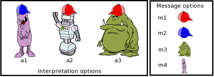
The three creatures on the left are possible referents, the icons on the right are available messages. The task is to play a simple communication game. In the speaker role, participants use one of the available messages to refer to a given creature (production trials). In the listener role, participants guess which of these creatures the speaker is trying to refer to with the use of a given message (interpretation trials).
The details of this experiment are not important here. It’s just an example of a case where the data is multinomial: in production trials the choice of participants is always one out of four possible message options; in interpretation trials, the choice is one out of three potential referents. The data from such a task would then consist of counts, such as the number of times a referent was chosen when the presented message was a red hat, which in our experiment was:
a1         a2         a3
1          470        141
This is just one condition, of course. Usually, there will be more. But this suffices for illustration.
Models for multinomial data
A lot of recent and highly exciting work supplies such count data with computational models that, usually, couch some intuition or informal theory into a formal framework that makes predictions about each choice’s probability. In the case above, for instance, we may consult the interpretation of the Rational Speech Act model or some other incarnation of similar ideas (see, e.g., Franke & Jäger 2016 for overview).
Suppose then that some (fictitious) model gives us a probabilistic prediction about how likely each choice of referent should be:
a1        a2          a3
0.001     0.8         0.19
The obvious question to ask is: how good is this prediction? Can we submit a paper based on this model and write something like: “the model explains the data well”?
One simple idea is to look at the predictions and at the observed choice frequencies and to check how much they are aligned. Here is what I will call a prediction-observation plot from here onwards.
pred = c(0.001, 0.8, 0.19)
obs = c(1,470, 141) / sum( c(1,470, 141) )
qplot(pred,obs) + ylab("observation") + xlab('prediction') +
  geom_abline(slope = 1, intercept = 0, color = "firebrick") + xlim(c(0,1)) + ylim(c(0,1))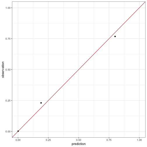
The perfect model would predict exactly the observed frequencies. So, for the perfect model, all points in a prediction-observation plot would lie on the straight line with intercept 0 and slope 1, plotted above in red. Seen in this light, the predictions by our fictitious model seem to be very good, impressionistically speaking.
Correlation scores
Let’s put a number to the impression, because numbers convince by implicit gesture towards rigor. A number of papers have used correlation scores for this purpose. I will not point to any paper and certainly not to any person in particular, except for this one lost soul: myself! Yes, I have used correlation scores to suggest that a model is doing a good job. But the practice is far from ideal. To see this, let’s first look at what correlation scores are.
Let be a vector of observations and a vector of predictions, equally long and aligned with each other. Pearsson’s correlation coefficent is then defined simply as the covariance between and divided by the product of their standard deviations:
The correlation coefficient in the simple case above is then:
cov(pred,obs) / ( sd(pred) * sd(obs))## [1] 0.9977751This looks pretty good, and may be considered a measure of the quality of the model.
Some problems
Insensitivity to number of observations
Suppose we have two conditions. One is as before, the other with some fictitious data like so:
## # A tibble: 6 x 5
## # Groups:   condition [2]
##   condition counts predictions frequencies N_per_condition
##      <fctr>  <dbl>       <dbl>       <dbl>           <dbl>
## 1        C1      1  0.00100000 0.001633987             612
## 2        C1    470  0.80000000 0.767973856             612
## 3        C1    141  0.19000000 0.230392157             612
## 4        C2     10  0.08333333 0.083333333             120
## 5        C2    100  0.83333333 0.833333333             120
## 6        C2     10  0.08333333 0.083333333             120
A few things to notice here. Firstly, we have far less observations for the second condition, only 120 as opposed to 612. Secondly, the predictions of the model are perfect for the second condition.
The correlation of predictions and frequencies is 0.9985, which would indicate that the model is really good. This seems intuitive, because it predicts the first condition really well and the second condition perfectly. However, this is not the point. The point is simply to highlight that the correlation score will not reflect the number of samples taken by condition. If we had a count of or of for condition 2, the correlation score would have remained unchanged. This is okay for condition 2 in isolation, because the prediction remains perfect in each case, but it is odd because it does not reflect that the “goodness” of the model in condition 1 should have a different weight in each case. If there are more observations in condition 1, the slight imperfection should, intuitively speaking, weigh more than when there are more observations in condition 2.
Bottomline: since correlation scores only look at the frequencies of choices, normalized by each condition, we lose information about the total number of samples in each condition. So we loose the intuition that predicting frequencies very closely should be a greater achievement if there are many samples than when there are only few.
High correlation for questionable models: Part 1
Let’s assume that we have a vector of predictions for several independent binomial conditions for simplicity:
pred = jitter(c(rep(.9,100), rep(.1,100)), factor = 0.1)
obs = jitter(c(rep(.9,90), rep(.6,10), rep(.1,90), rep(.4,10)),factor = 0.1)
show(qplot(pred, obs) + ylab("observation") + xlab('prediction'))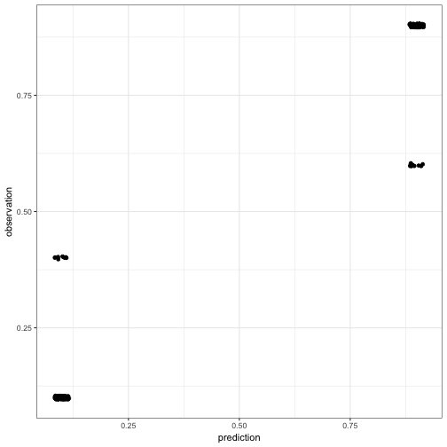
The correlation score of 0.9717 is very high (and immensely significant). We are heading towards a publication here!
But wait a minute. Actually, half of our prediction values are superfluous in a sense. If we predict choice probability for one option, the model must predict for the other, of course. Similarly if the observed choice frequency of one option is , that of the other must be . So what happens if we scrap the redundant part of our data? Let’s grab the predictions and frequencies for only one of the two options:
predInd = pred[1:100]
obsInd = obs[1:100]
show(qplot(predInd, obsInd) + ylab("observation") + xlab('prediction'))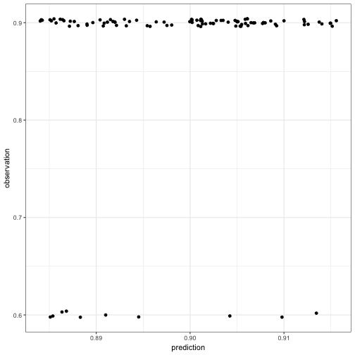
That doesn’t look like a tremendous achievement anymore and, indeed, the correlation score is a poor man’s 0.166.
Bottomline: if we look at what the model predicts for both choice options, we get a very high correlation. But predictions and observations for one choice option fully determine the other, so this part of the information seems entirely redundant. Yet, if we leave it out, our measure of glory plummets. What to make of this?
High correlation for questionable models: Part 2
Let’s look at another dodgy model with a shiny correlation score. Suppose that the model predicts a single choice probability for all conditions in a binomial choice task and we observe (miraculously) the same frequency of choices for all conditions, however, with a difference between these two. For example:
predUniform = rep(c(.9, .1), each = 100)
obsUniform = rep(c(.6,.4), each = 100)
show(qplot(predUniform, obsUniform) + ylab("observation") + xlab('prediction'))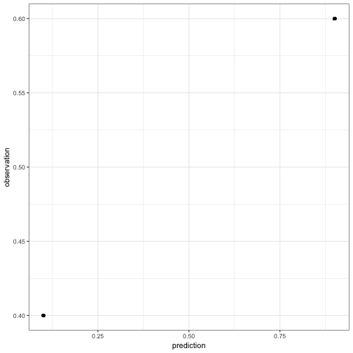
Yeeha! We have a perfect correlation of 1, because all prediction and observation pairs lie on a linear line. However, that line does not have slope 1 and intercept 0. Our model is not the perfect model.
Bottomline: the correlation score can be a perfect 1 even if the model is not the perfect model.
Showdown: bringing in likelihoods
Is this bad? Yes it is. Suppose that each condition had 20 observations. Then a theoretical prediction of .9 and an observed frequency of .6 is rather surprising, even for a single condition.
show(binom.test(12, 20, p = 0.9))##
## Exact binomial test
##
## data: 12 and 20
## number of successes = 12, number of trials = 20, p-value =
## 0.0004156
## alternative hypothesis: true probability of success is not equal to 0.9
## 95 percent confidence interval:
## 0.3605426 0.8088099
## sample estimates:
## probability of success
## 0.6A model which predicts this for 100 conditions (like assumed above) should be seriously reconsidered and presumably is very, very bad! Still, it can achieve a perfect correlation score.
What this means is that even though for each condition the model’s prediction is, let’s say, not very good, by exploiting the fact that half of the frequency observations are a linear function of the other half, and likewise for the predictions, we get a perfect correlation score. The model is devilishly dubious, but the corrlation rocks heavenly!
This problem also affects the previous case where we had most predictions coincide with the observed frequencies, of course. If every condition had 20 observations, the surprise of predicting .9 and observing 12 out of 20 does persist. From a likelihood perspective the model is shaky while the correlation is high.
Conclusion
Here are just a few examples that gesture towards the conceptual inadequacy of correlation scores as measures of model fit for categorical data. This does not speak to the case where a model predicts a metric variable (e.g., ordinary linear regression), where correlation scores have a clear interpretation and their use a clear rationale. Another issue not touched by any of the above is: what else to use to measure goodness-of-fit of a model for categorical data. Rescaled likelihood suggests itself, and I hope to be able to write about this soon.